ATRP and Market Leaders

Ever wondered why the same percentage gain on two stocks can look completely different? Which of the following do you think would be easier to hold on to?
Enter: Volatility
In the world of speculation, volatility is the living embodiment of the idea that the journey matters far more than the destination.
In traditional finance, volatility represents the frequency and magnitude of price fluctuations over a specific period. It serves as a primary measure of risk and uncertainty, indicating how rapidly an asset's value can deviate up or down from its current market price.
But is volatility actually risk? Let's quote Buffet:
"Volatility is far from synonymous with risk. Though this pedagogic assumption makes for easy teaching, it is dead wrong."
Then why study volatility in the first place? Well, the rules of speculation differ from the rules of investing. Or at least they do in ONE primary way:
Cutting losers purely based on price performance.
And that's exactly why volatility becomes important. When studying price, volatility acts as the 'noise' level of a price trend.
Low volatility typically results in a smoother trends where price tends to stay relatively closer to its moving averages with 'linear' pullbacks. Conversely, high volatility creates wide and choppy bases characterized by aggressive price swings and frequent 'shakeouts'.
Low Volatility and Market Leader Trends
Lower volatility stocks typically exhibit smoother trends because their price action is driven by steady institutional accumulation rather than speculative frenzy. When a stock has low volatility, it experiences fewer 'stop-hunts' and emotional spikes, which in turn helps it hold market structure more effectively.
This stability reduces the market noise that often triggers premature exits, making it easier to hold onto a position for several quarters. My study shoes that this is exactly what is needed to capture a 4 - 6 quarter up move that a Market Leader makes in a bull cycle (like the ones mentioned here). If you haven't read that article on Relative Volume and Market Leaders, I recommend you read it before you read this one.
Measuring Volatility Traditionally
Technical traders primarily measure volatility using two main mehtods:
- Standard Deviation of price changes to assess dispersion from the mean
- Average True Range (ATR) to track daily price movement
These two traditional measure of volatility are so common that they are used in banded indicators to create volatility bands around a mean. Think standard deviations around a Simple Moving Average to create Bollinger Bands or ATR bands around an Exponential Moving Average to create Keltner Channels.
Out of these two, ATR often helps set stops or trail systems while speculating. And while it is great just the way it is, I very quickly ran into a problem;
It wasn't comparable across two differently priced stocks.
Normalizing ATR to Compare Stock Volatility
That is exactly how I started studying ATRP or Average True Range Percentage or Normalized Volatility.
This is nothing but ATR/Close * 100
Once we have the ATRP values, comparing volatility becomes a lot simpler. A 5$ ATR would look different on a 50$ and 500$ stock but a 5% ATRP makes the comparison a lot easier.
However, keep in mind that, in general, small and mid-cap stocks show higher ATRP values than large-caps because they have lower liquidity and smaller market capitalizations. In these smaller companies, even a moderate institutional buy or sell order represents a larger percentage of the total available shares, causing the price to swing more violently than it would for a massive, highly liquid stock.
Now that we know this, the next obvious question is what ATRP threshold do market leaders generally trade around?
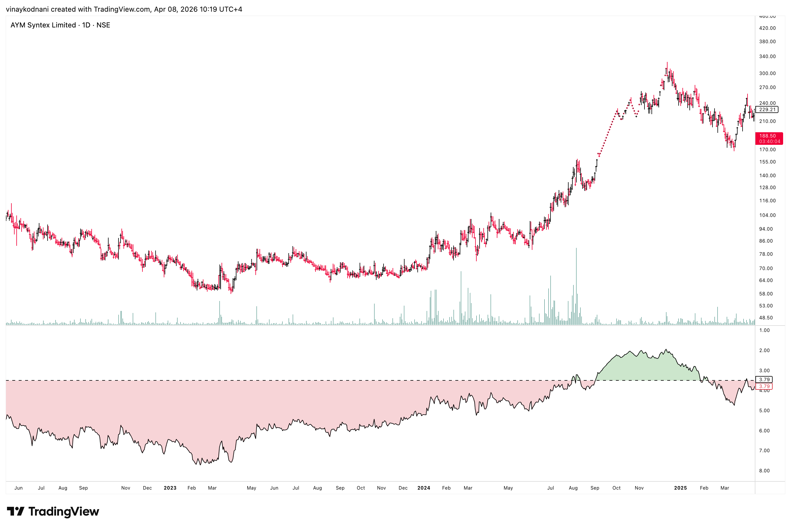
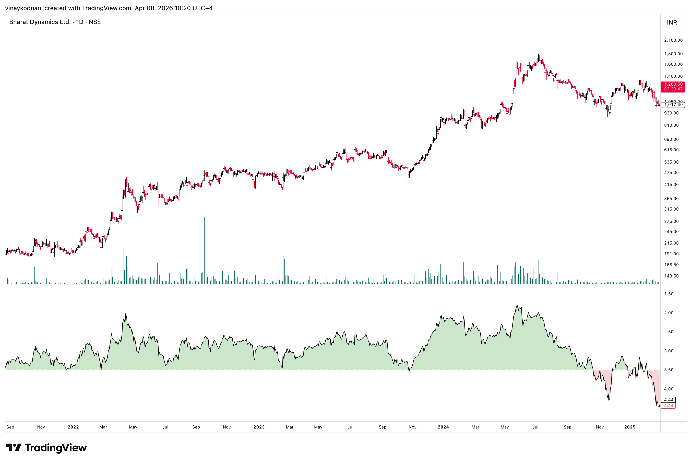
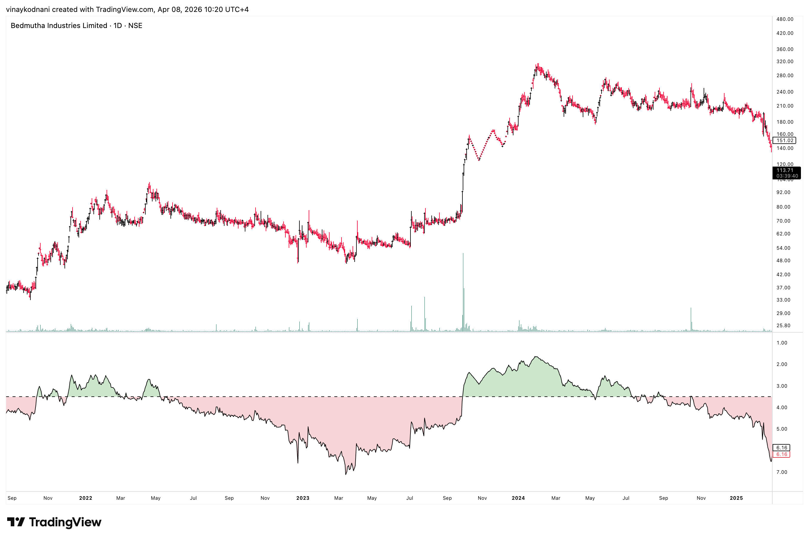
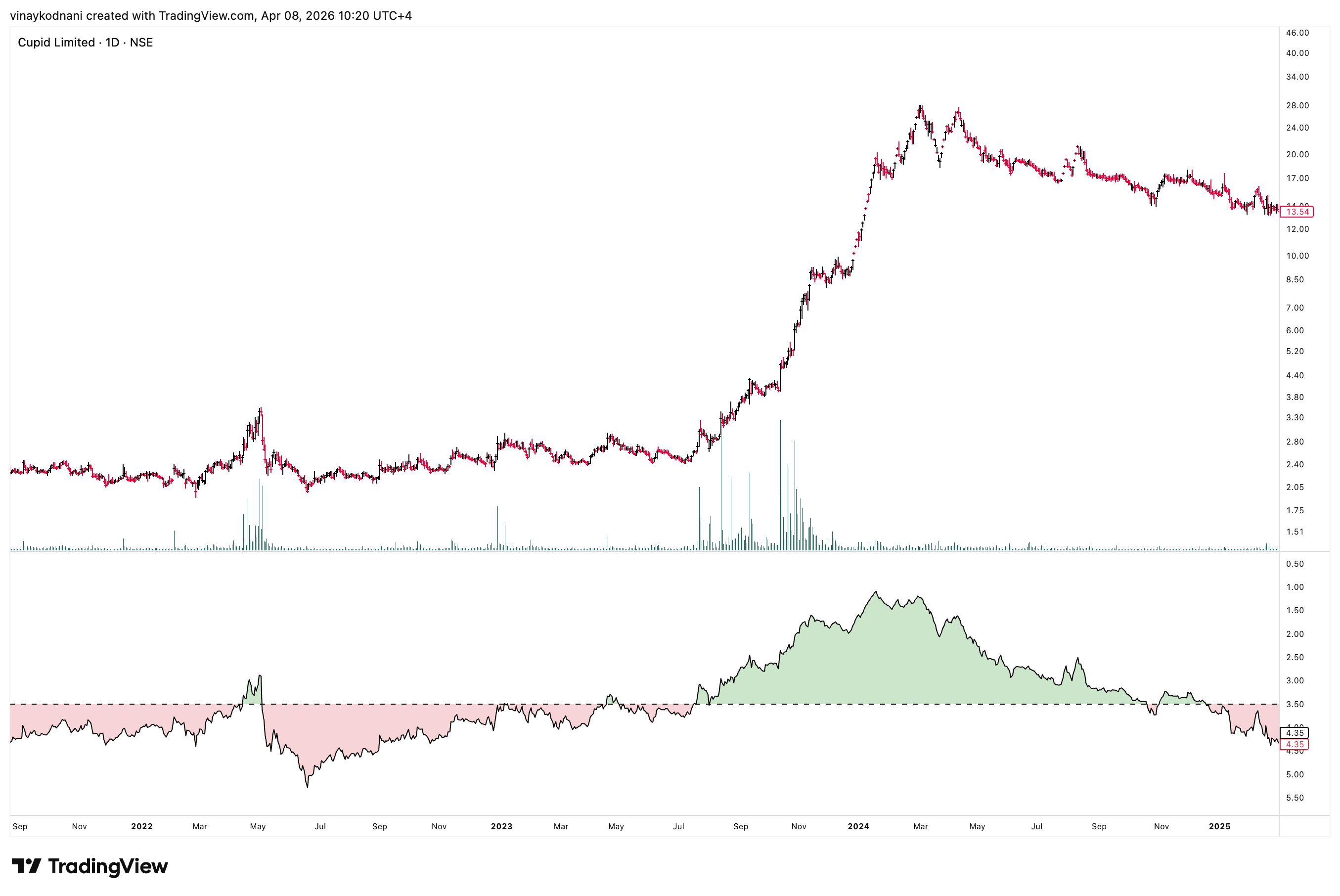
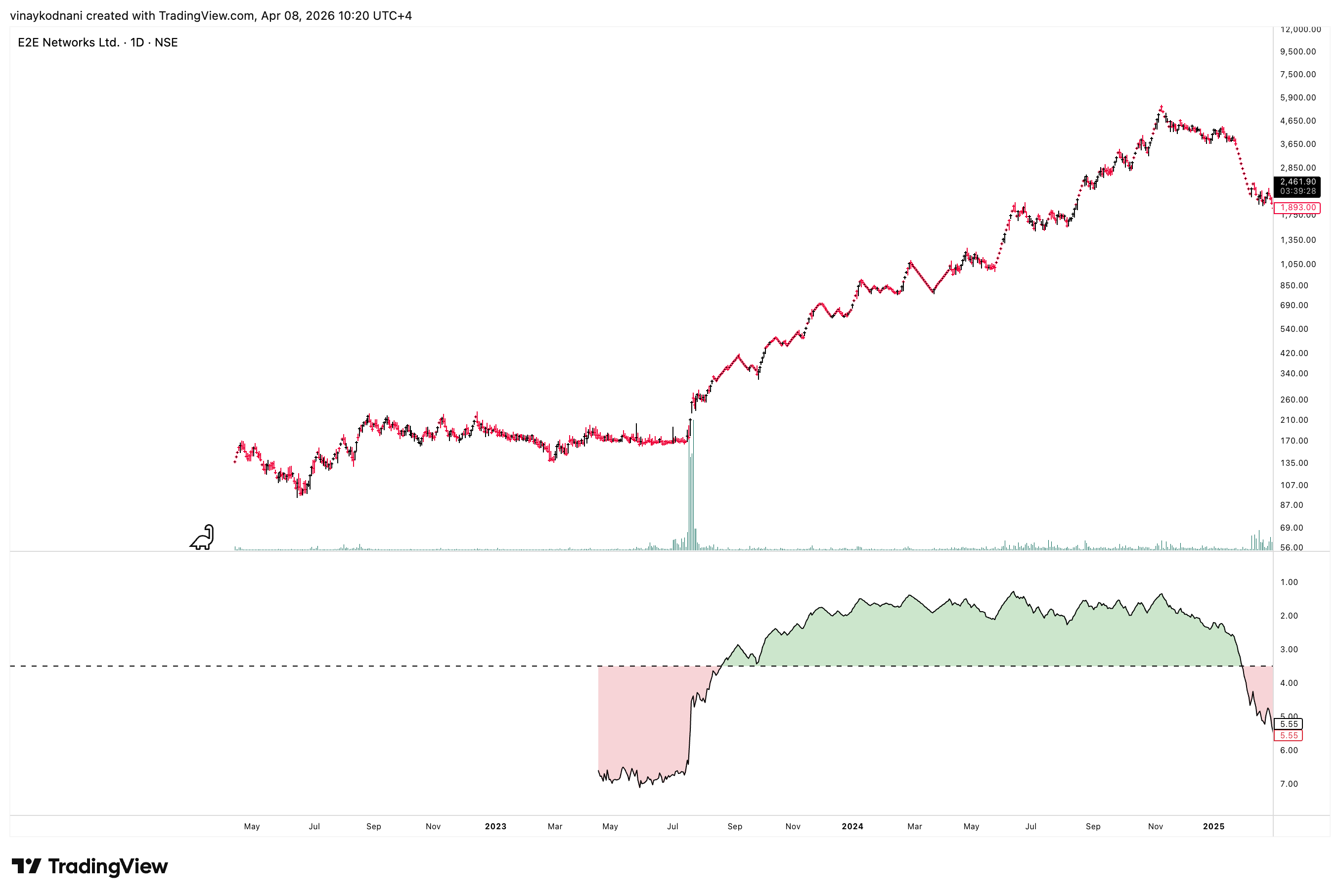
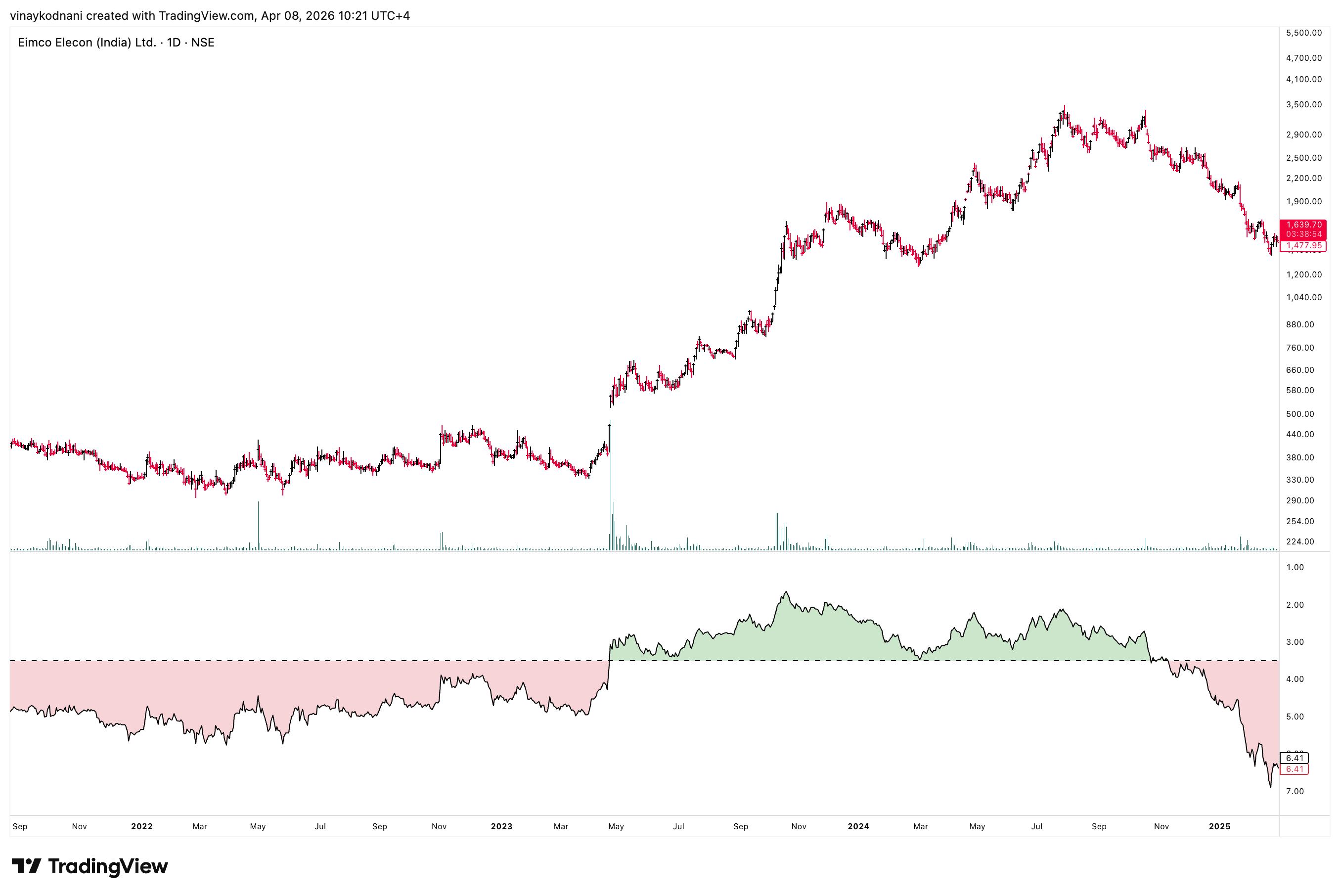
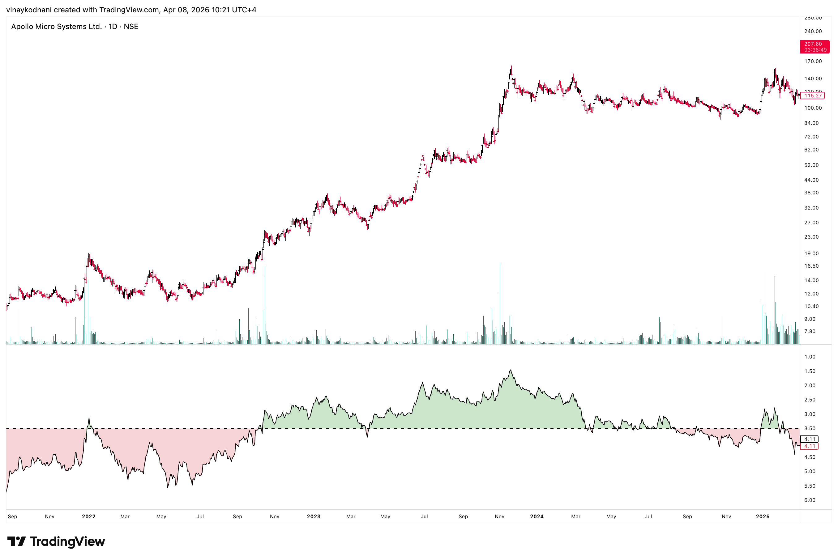
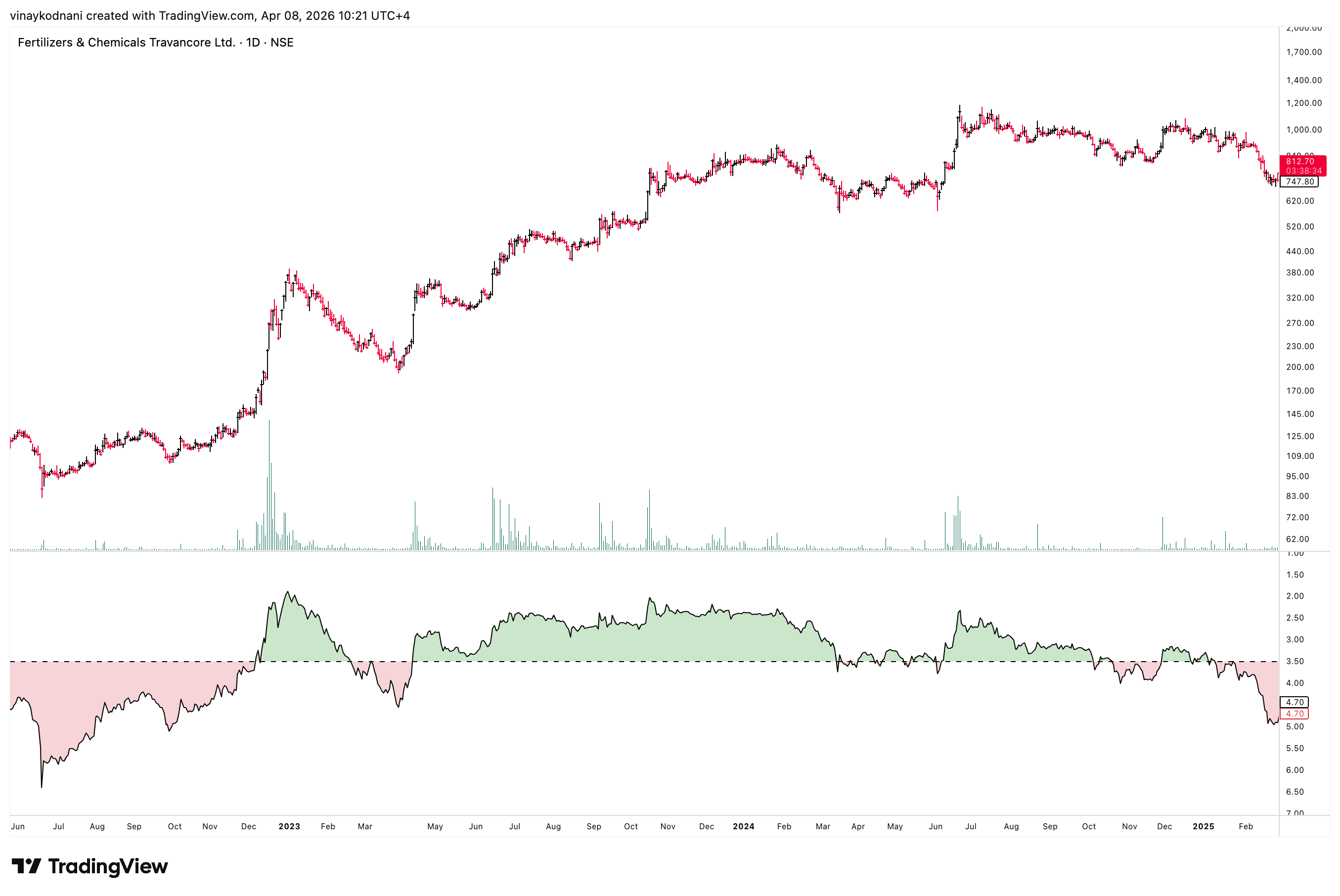
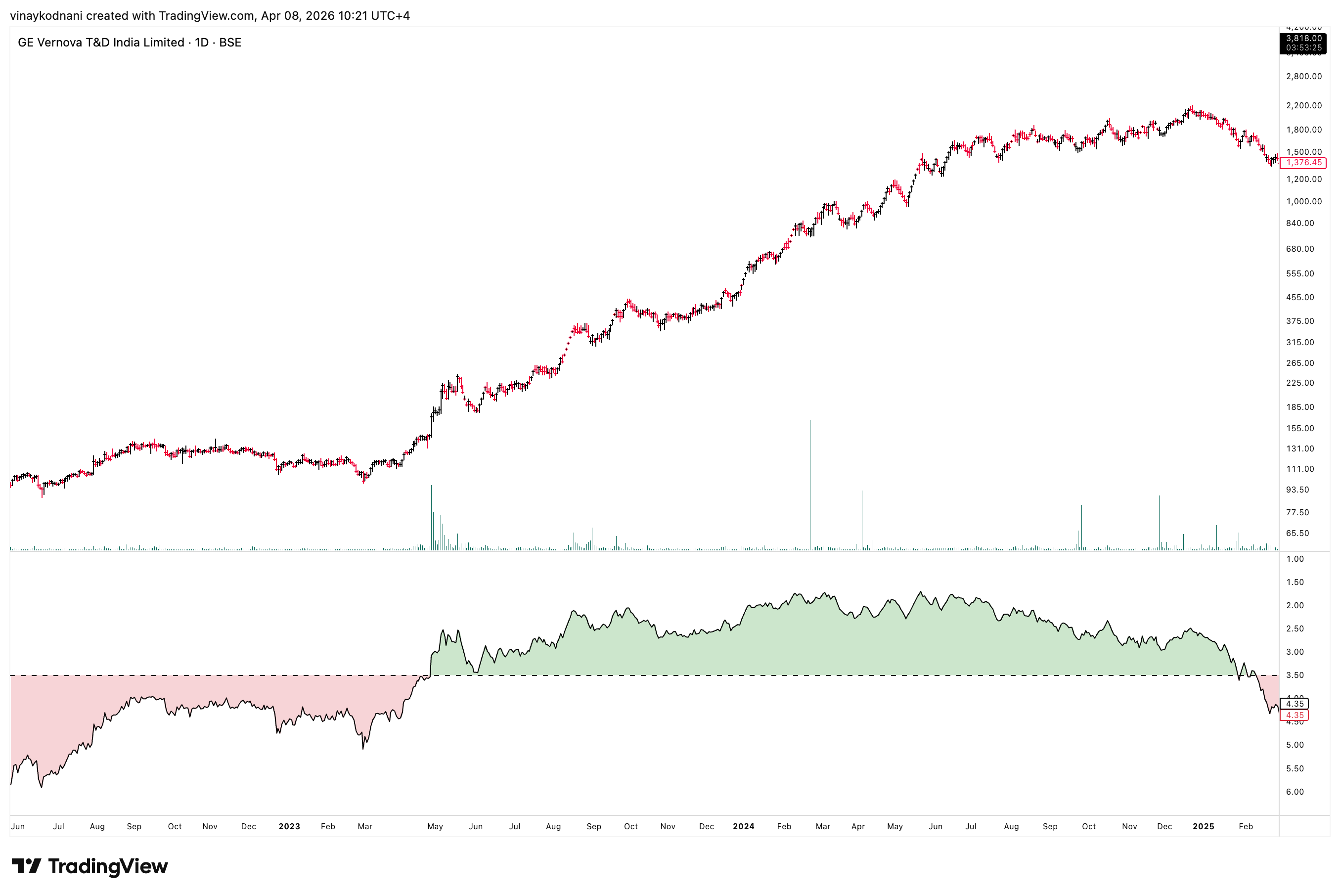
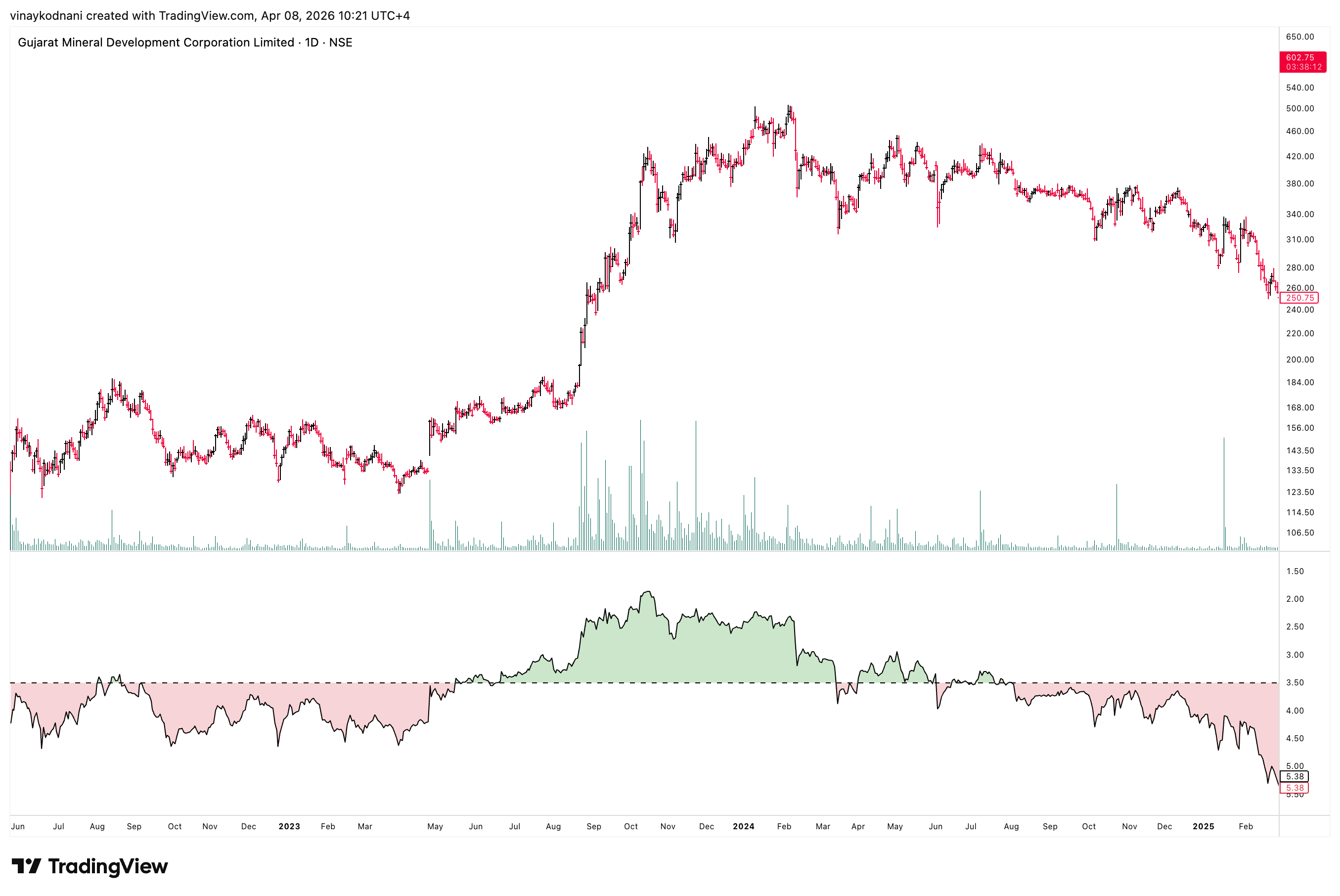
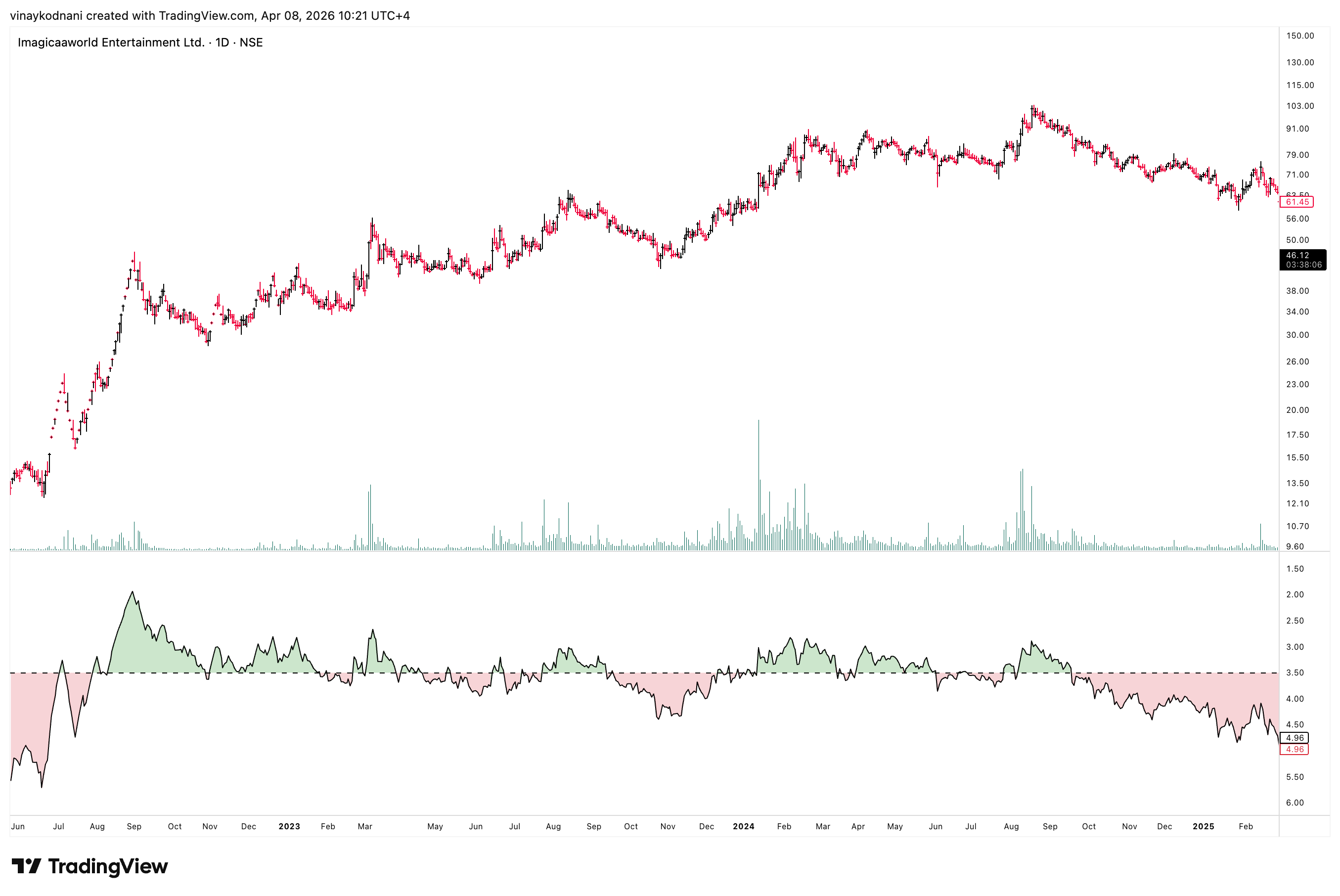
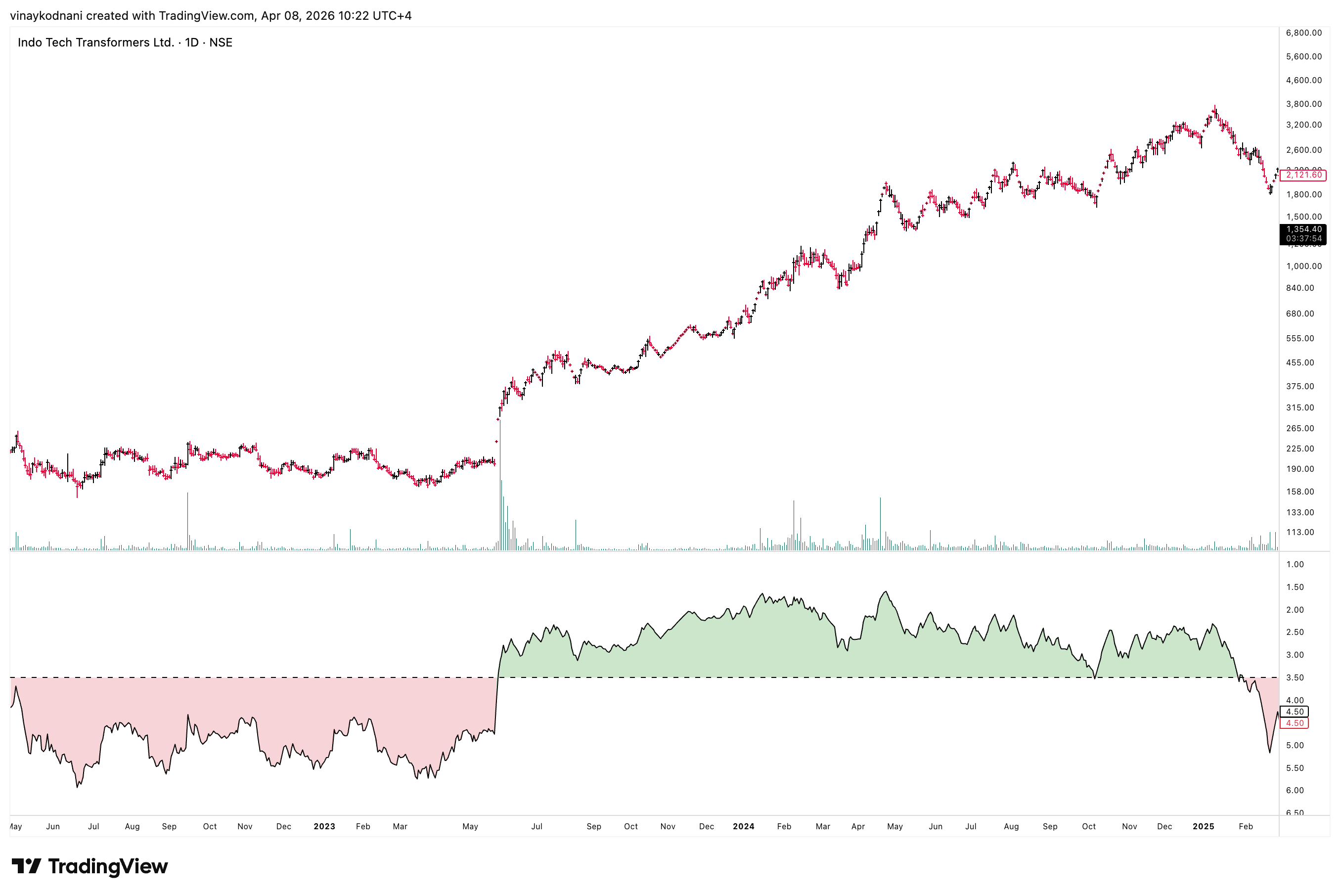
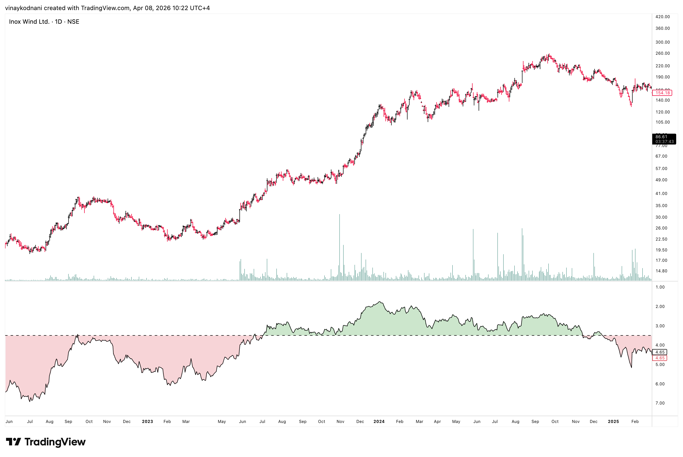
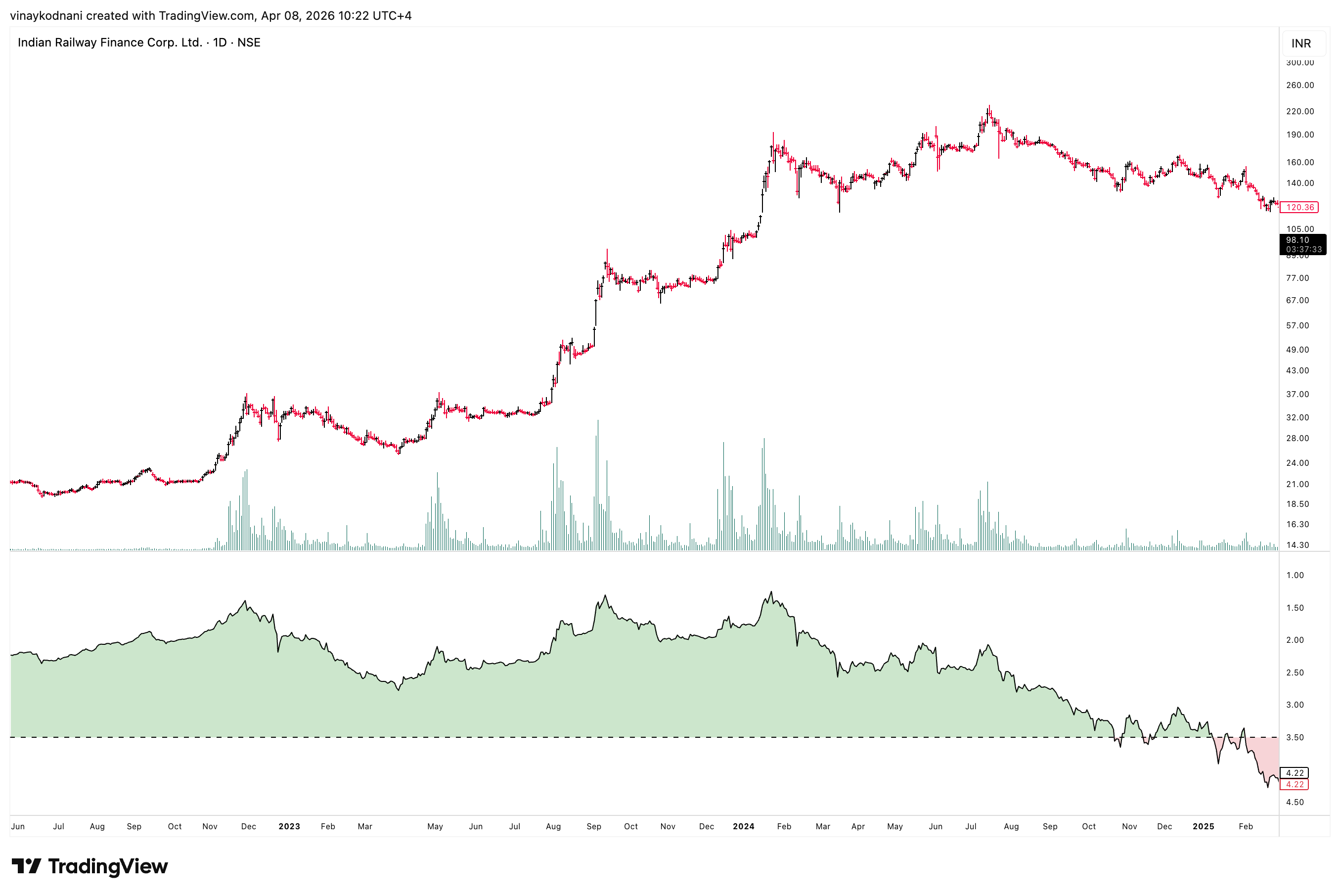
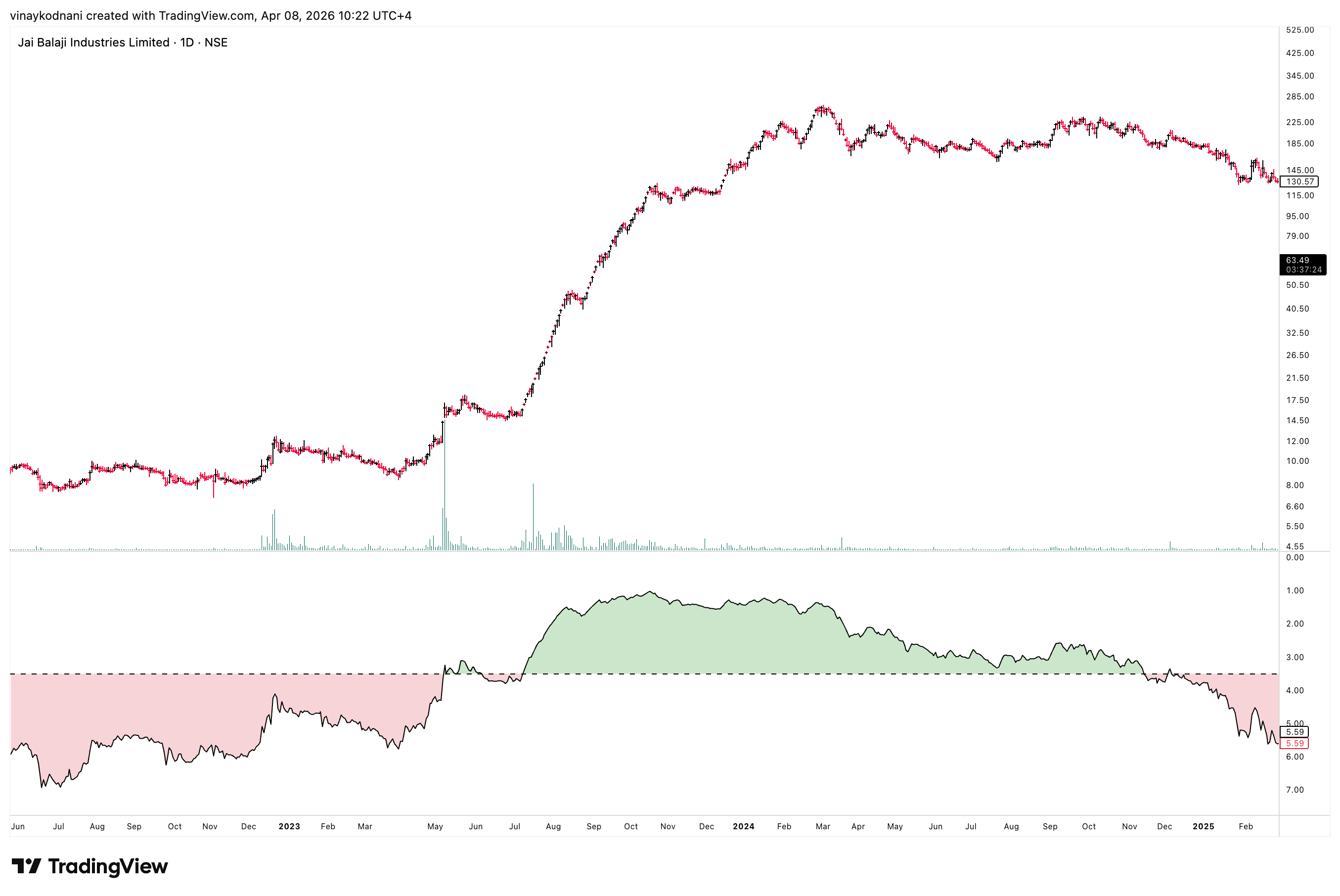
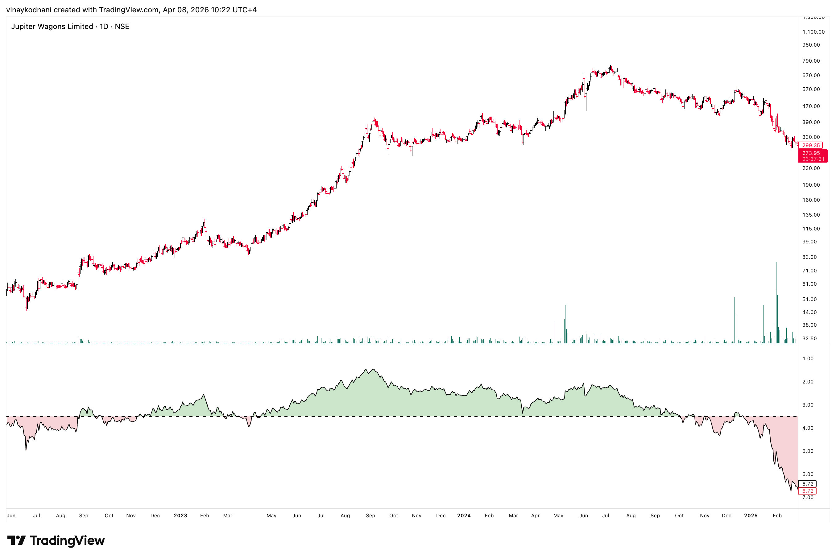
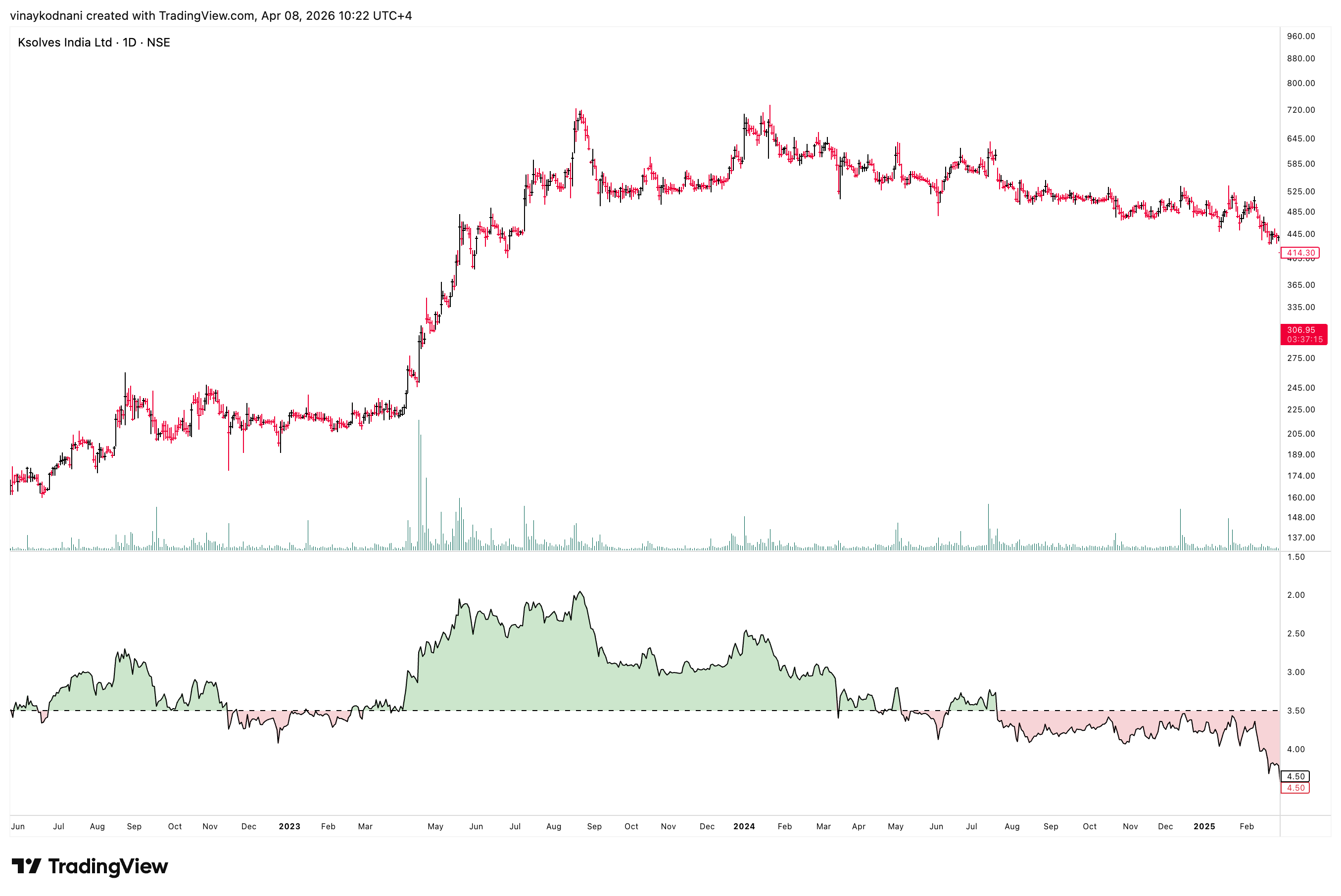
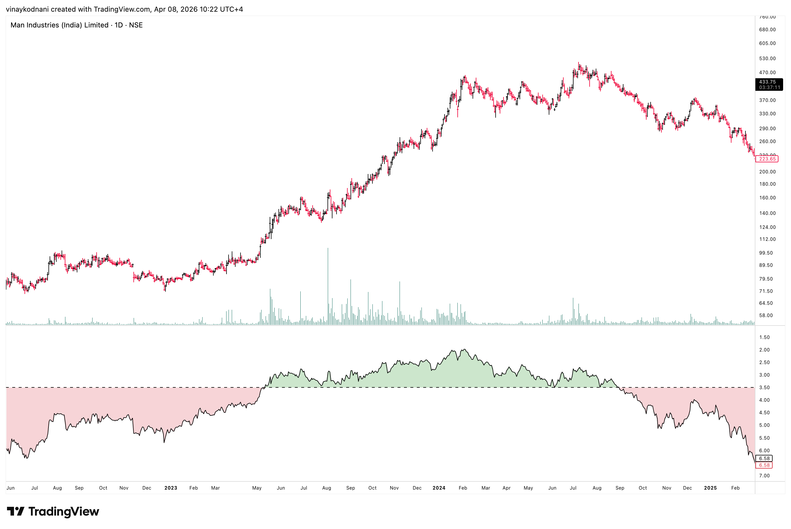
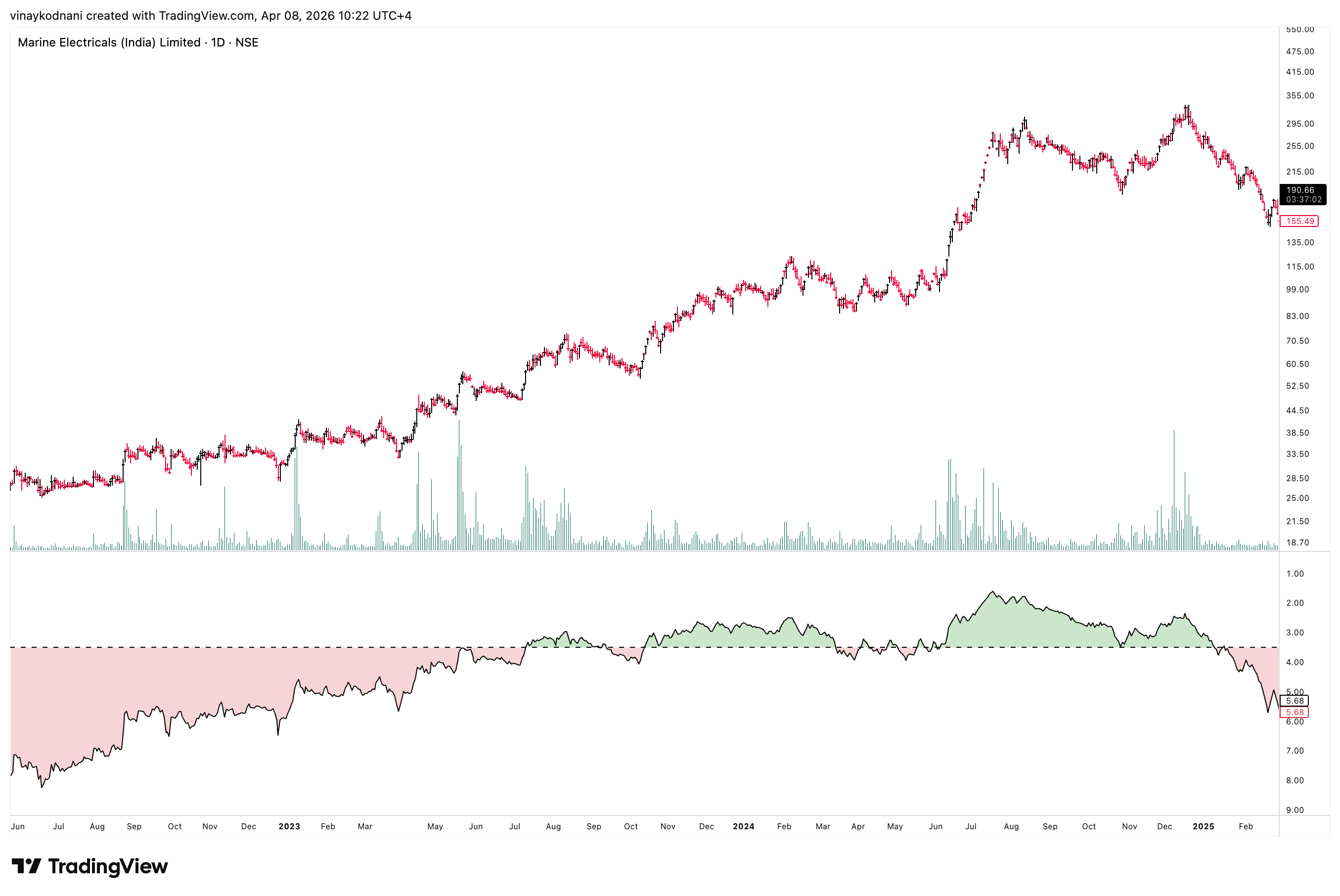
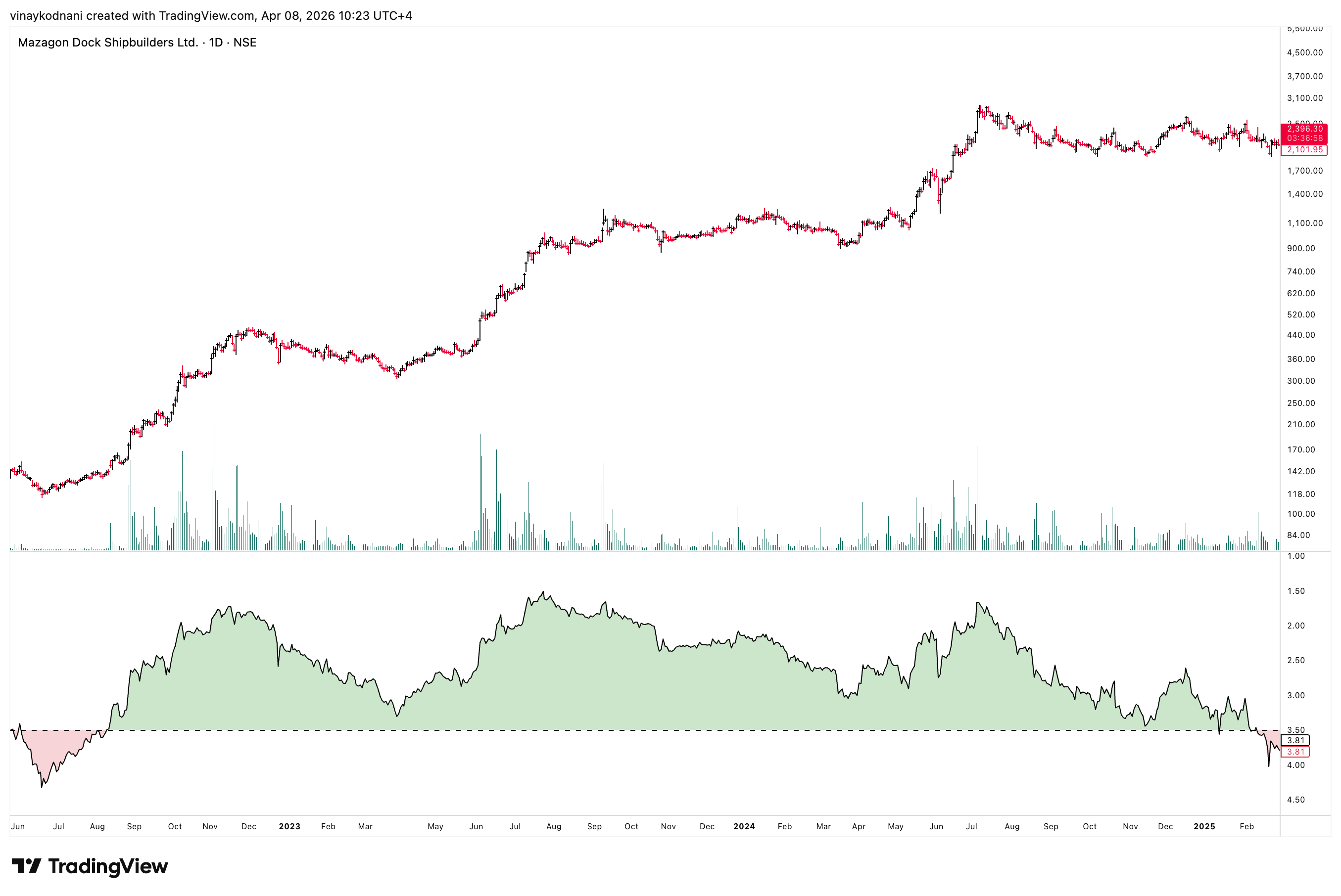
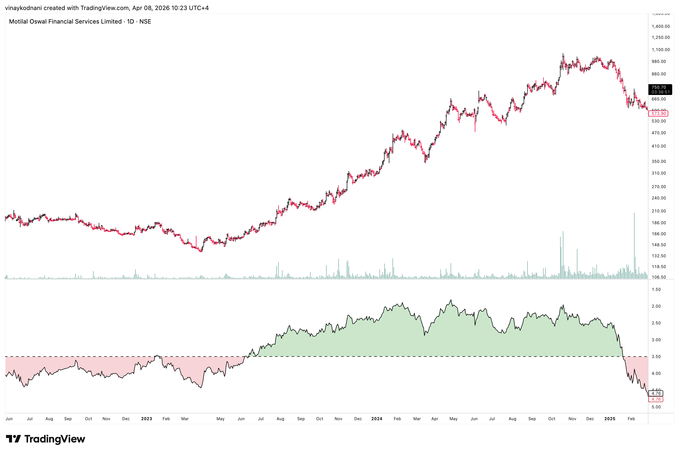
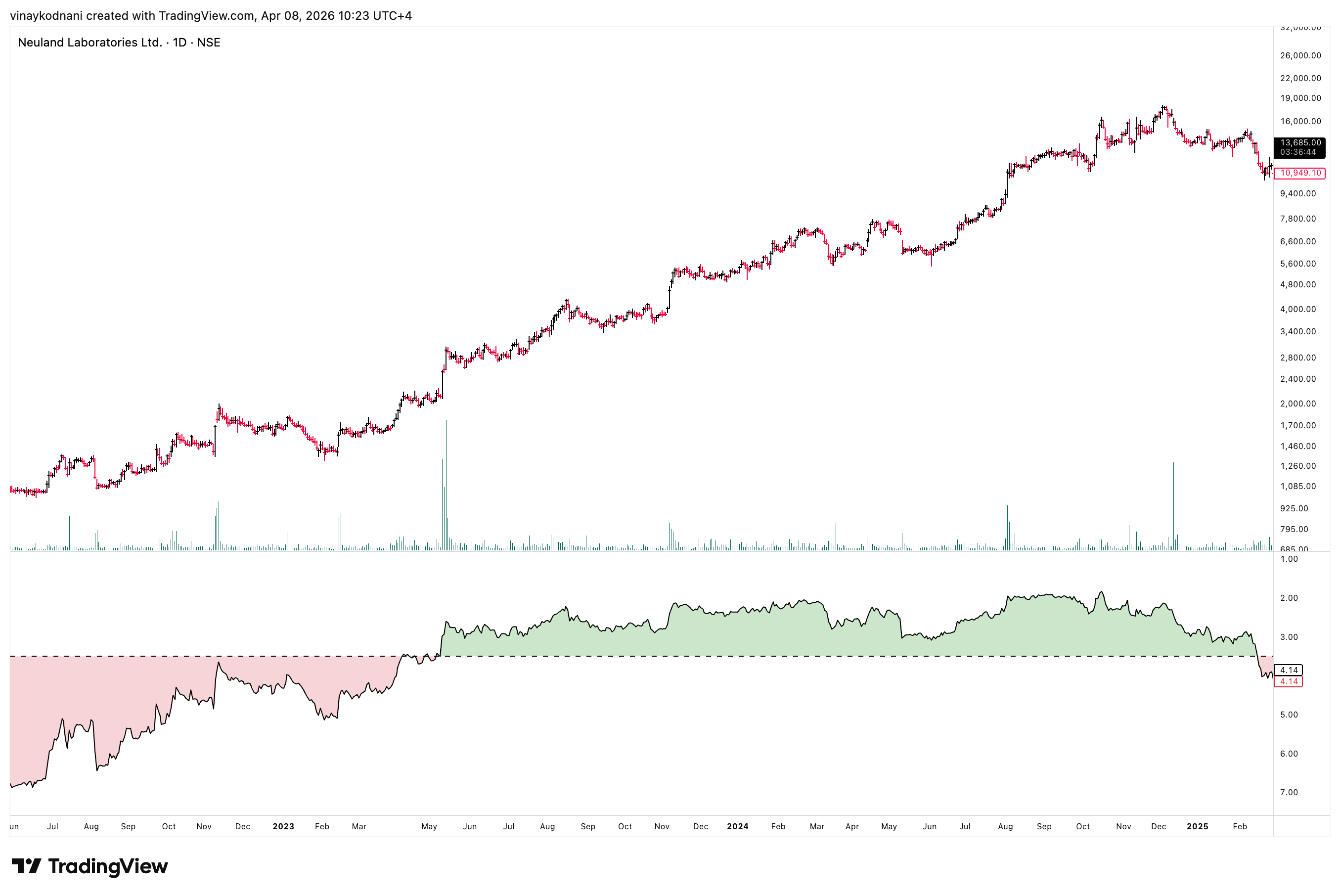
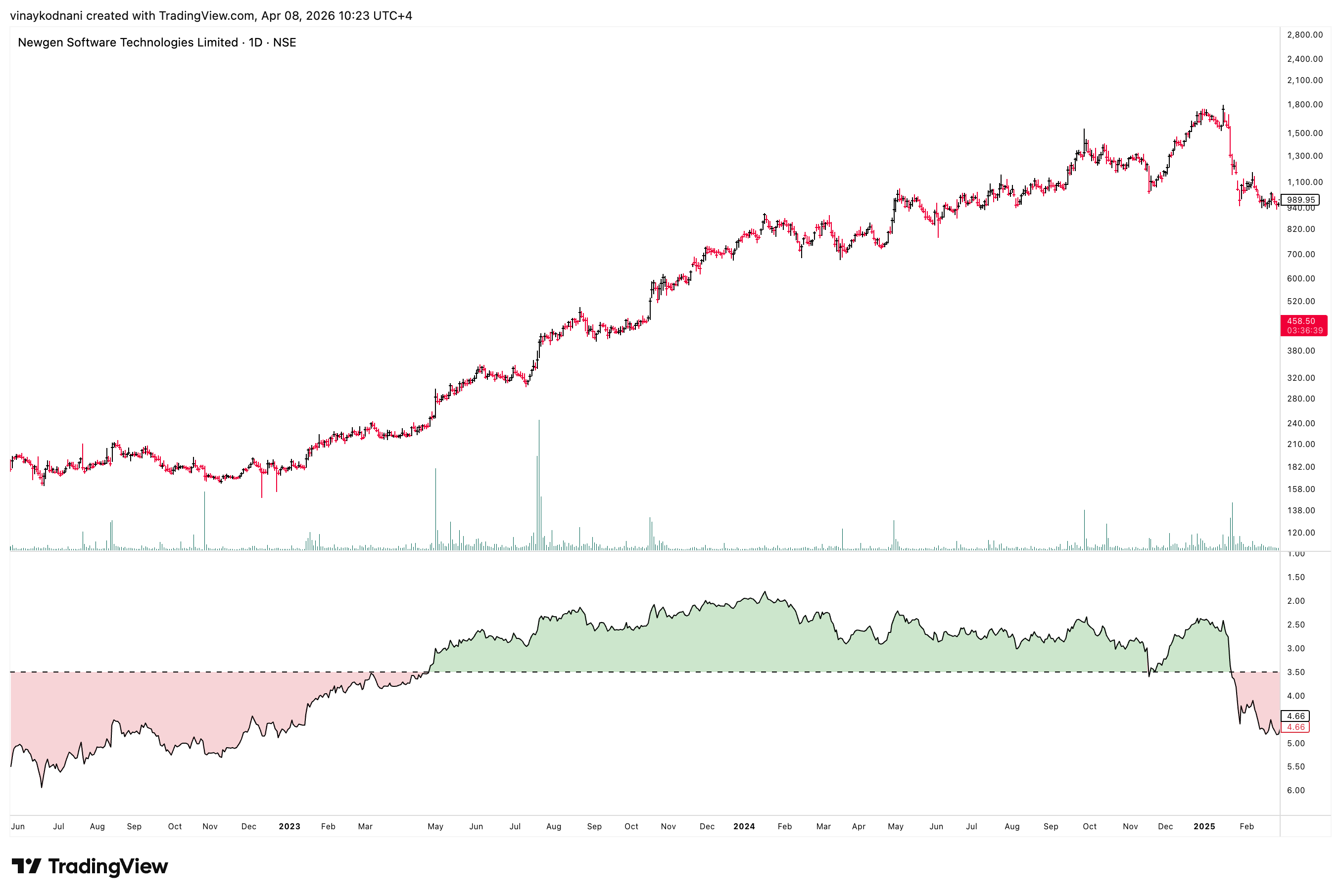
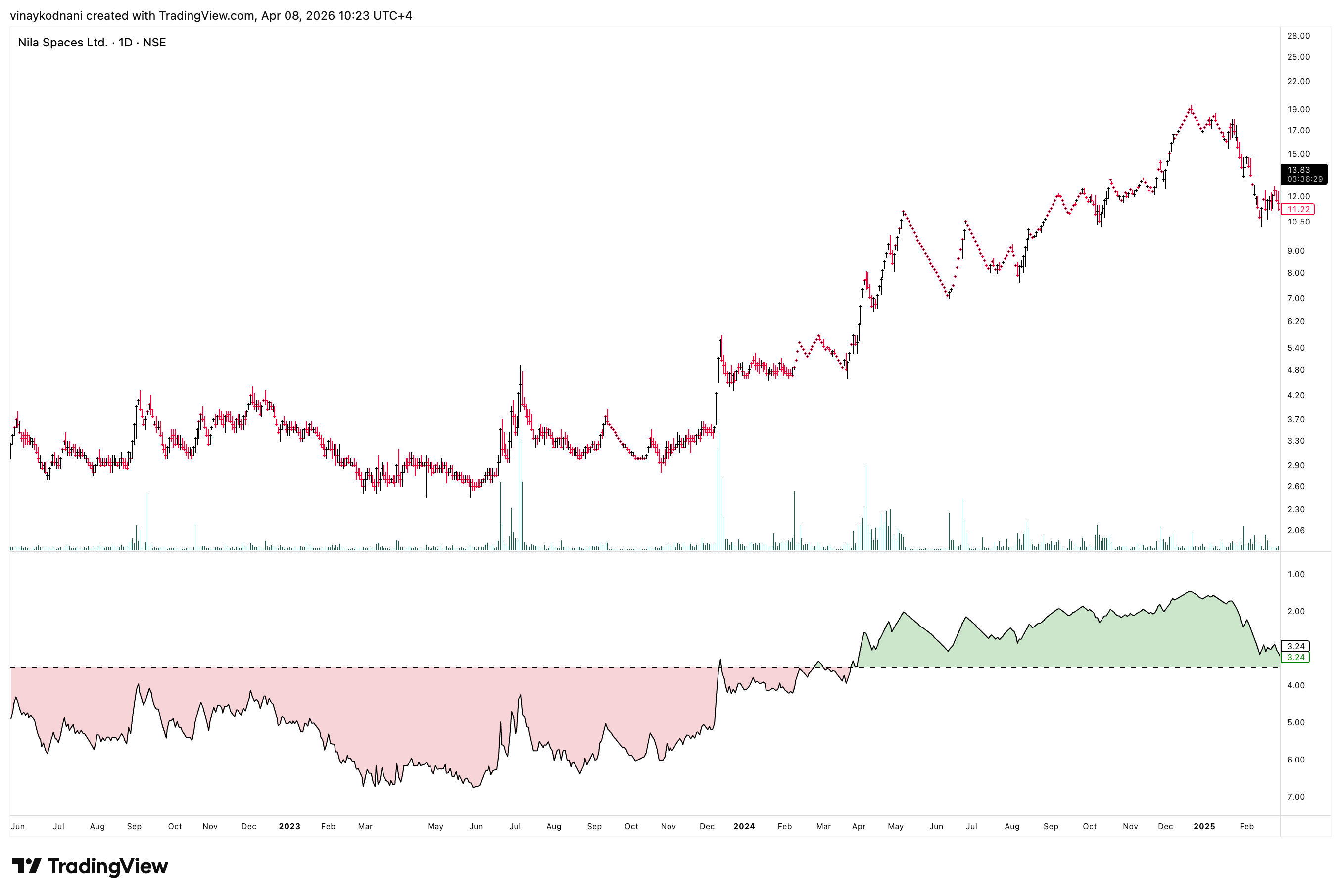
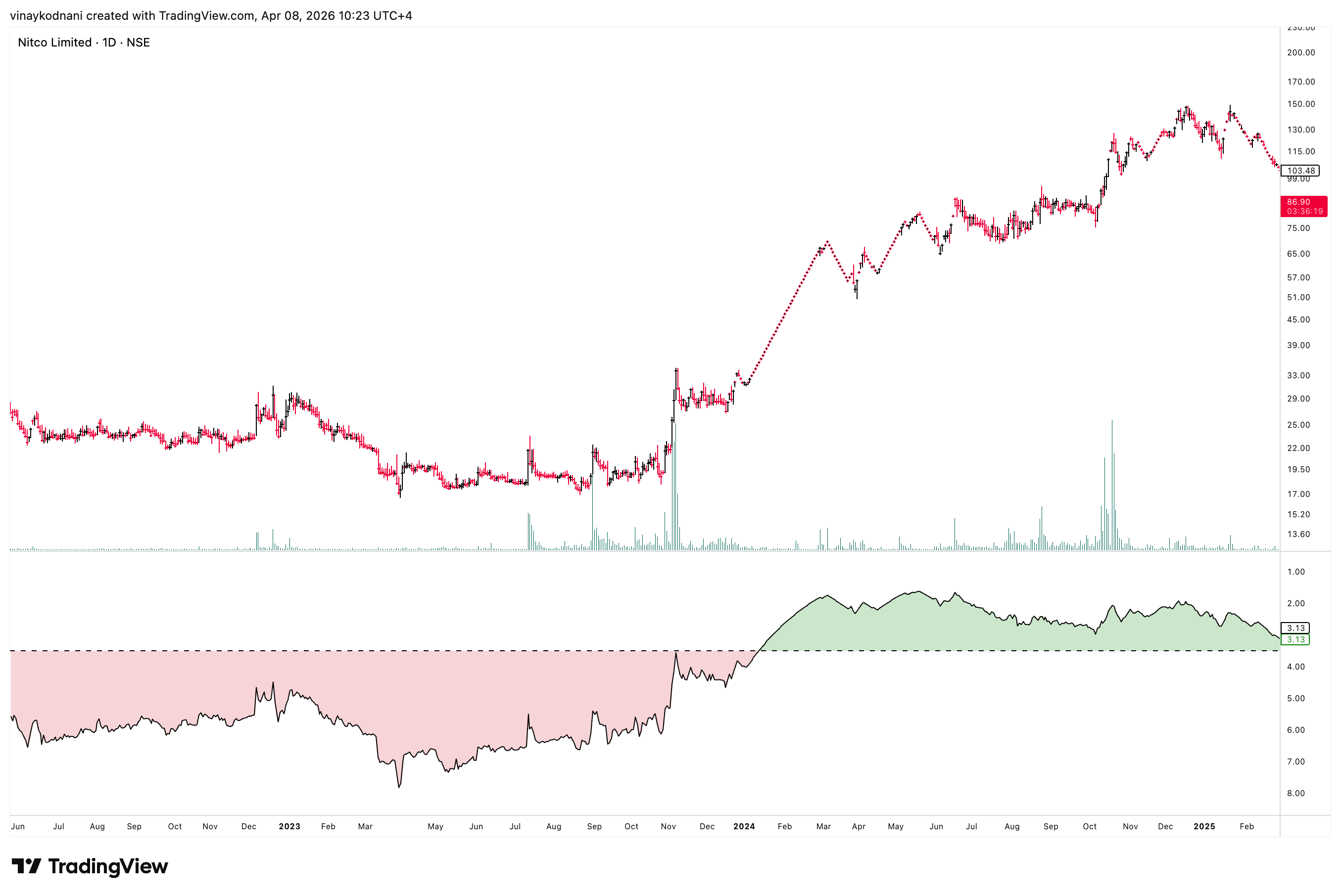
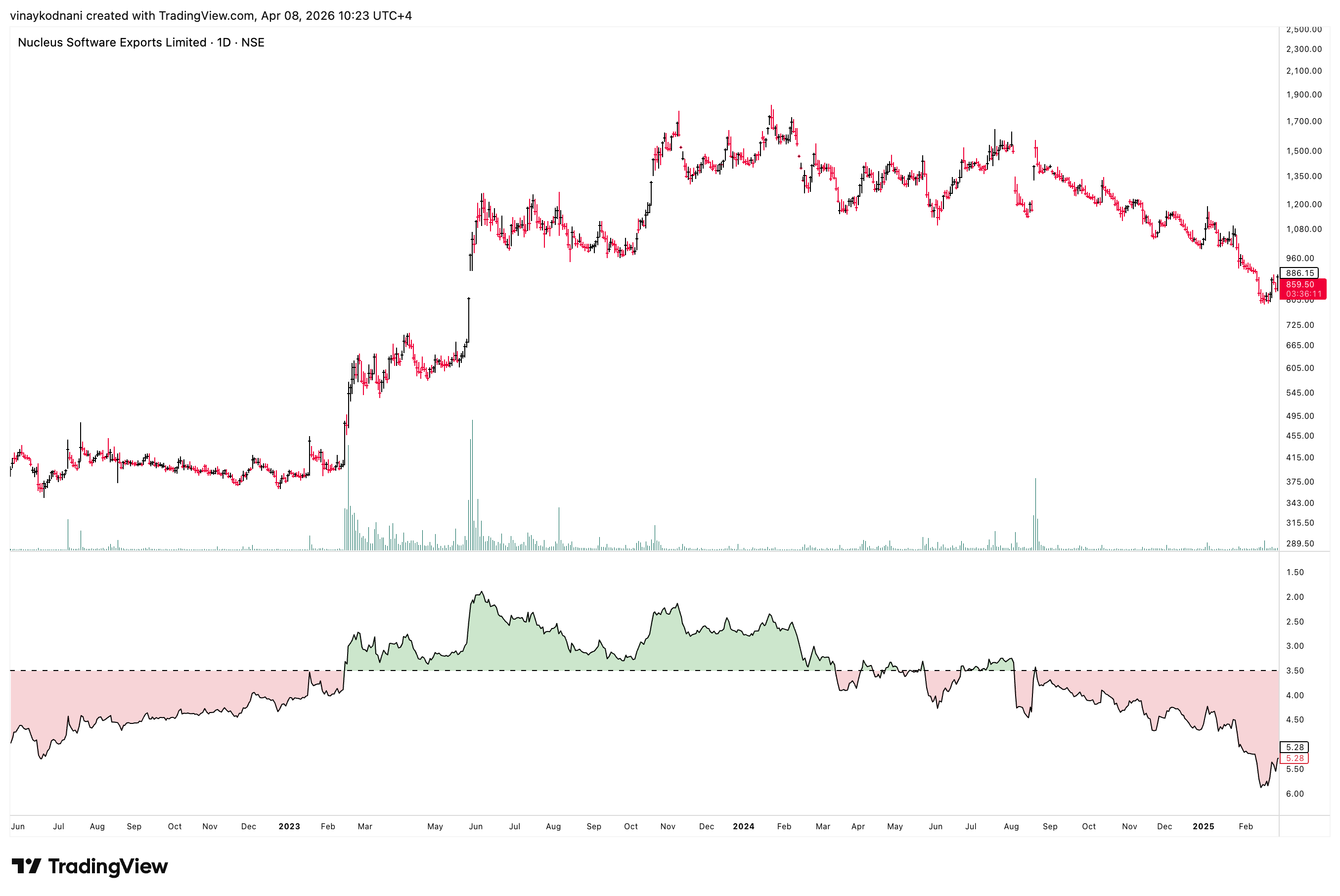
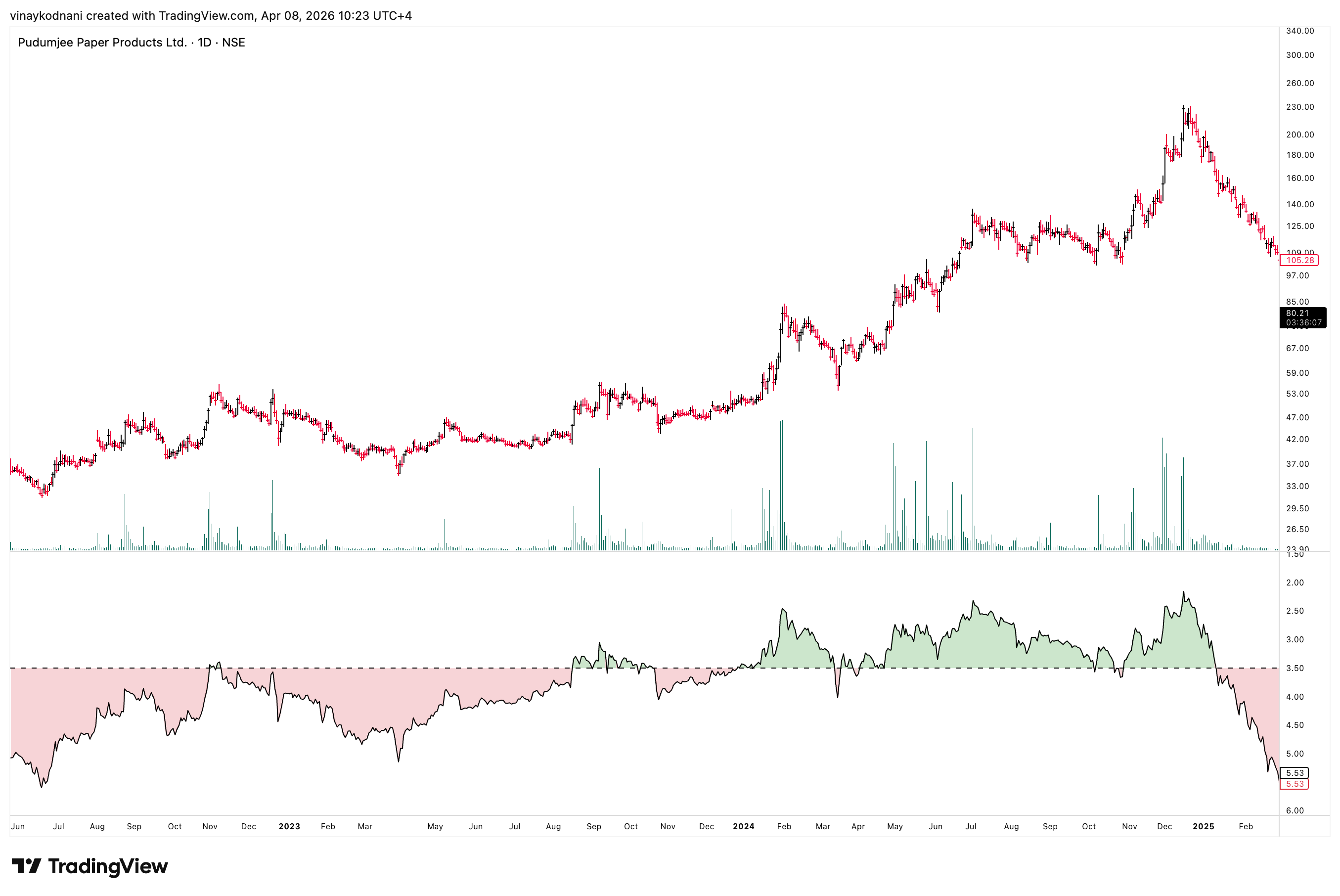
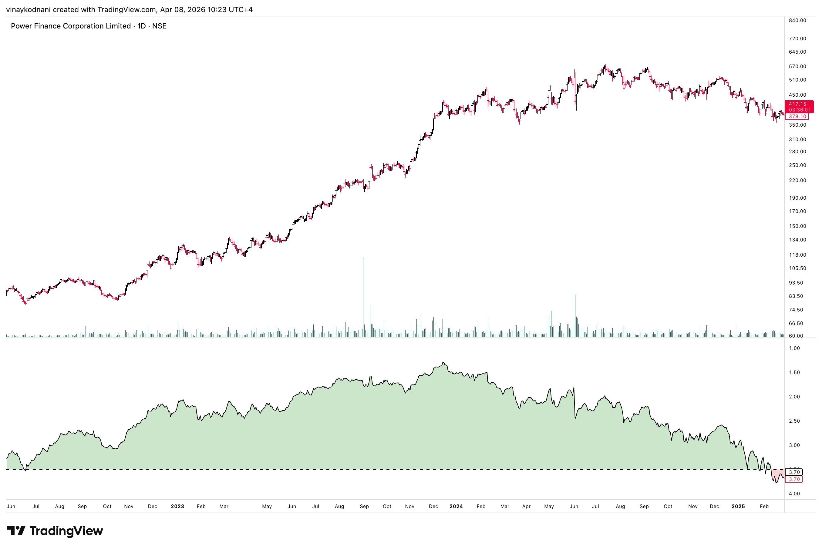
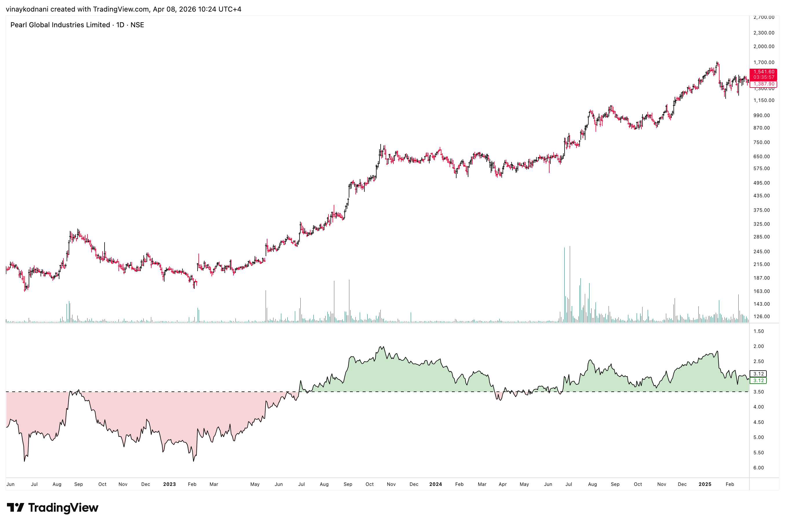
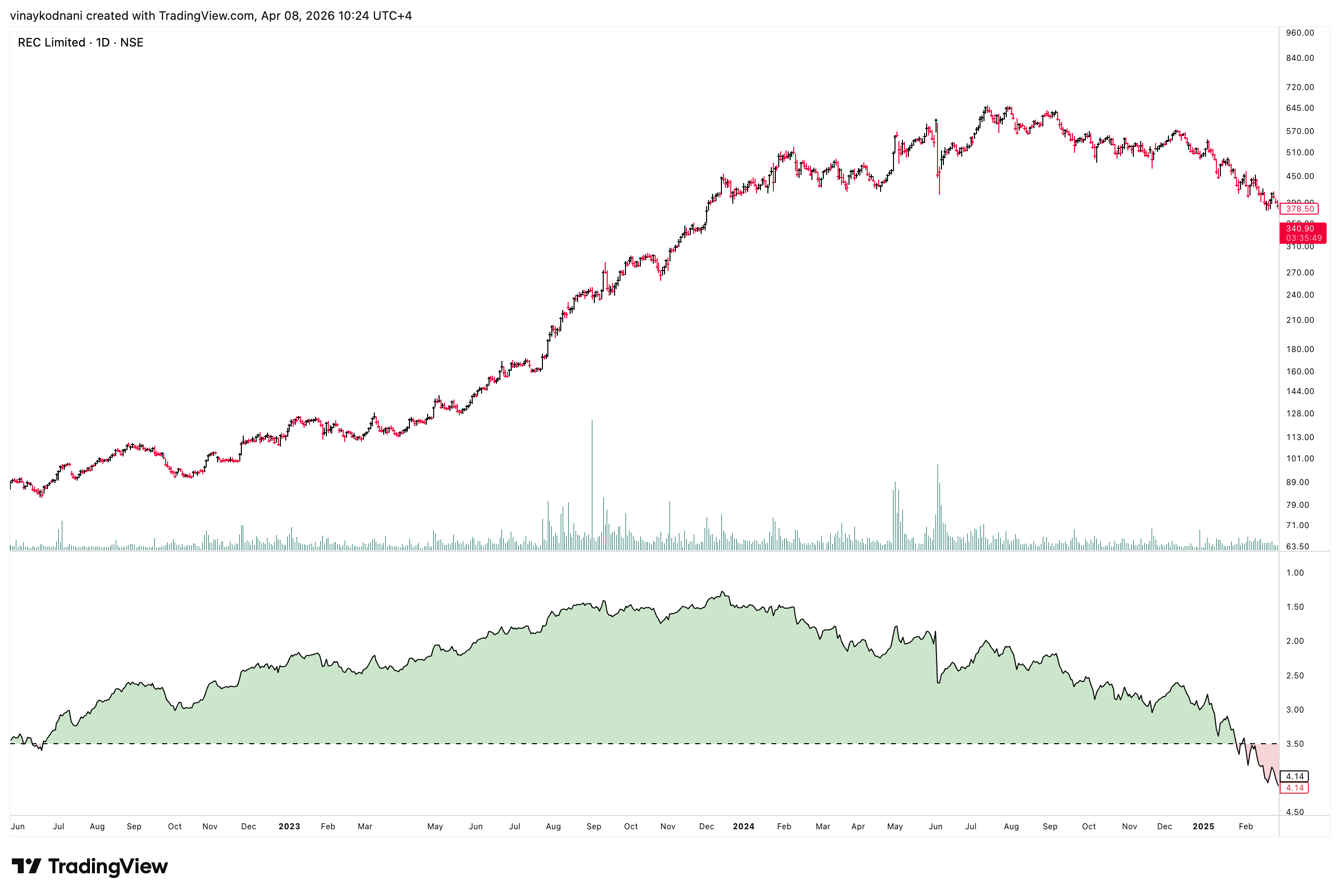
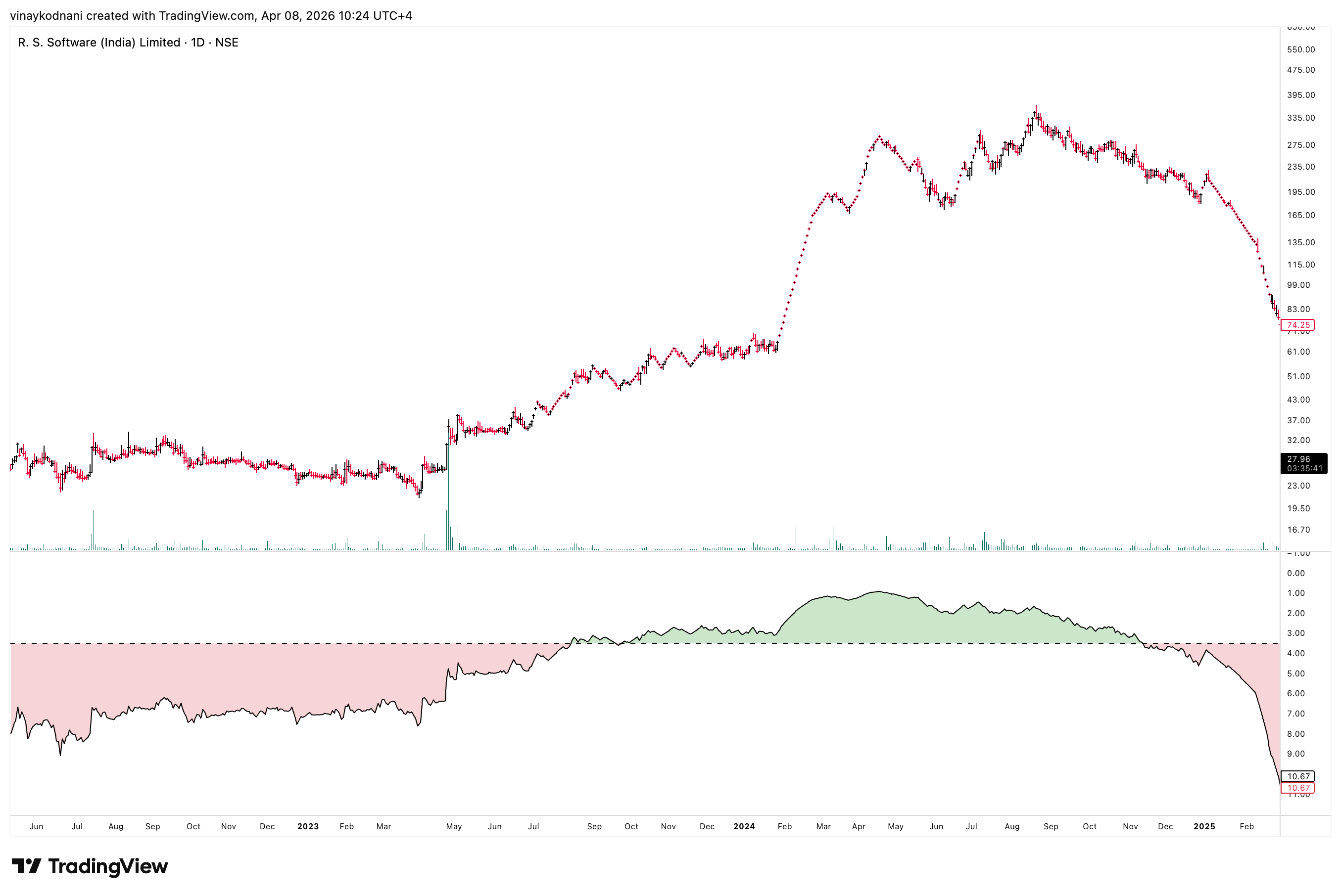
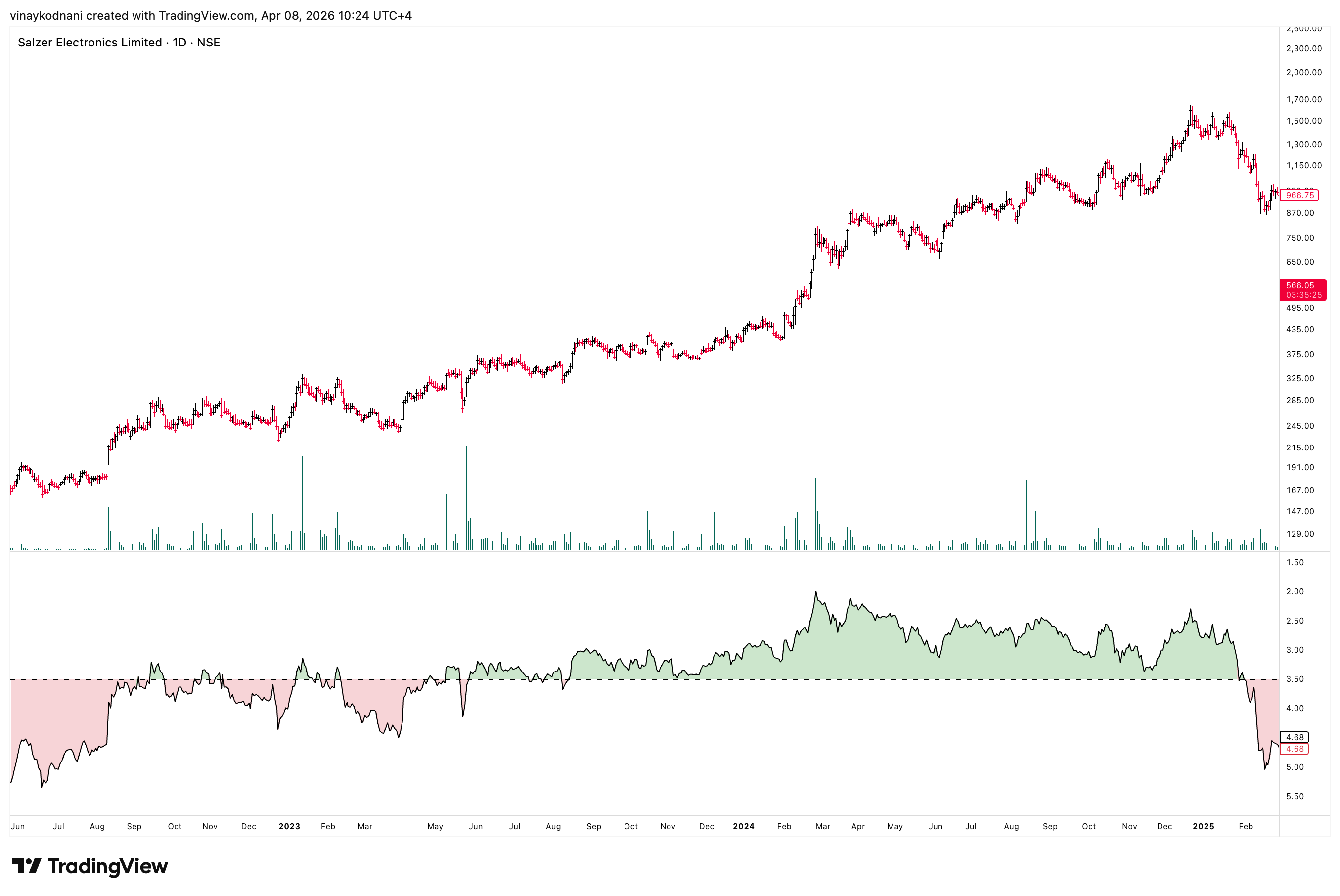
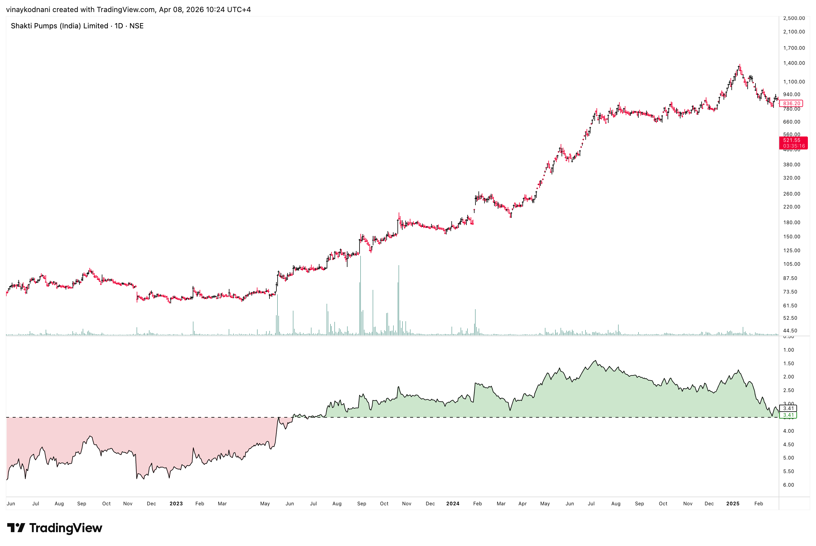
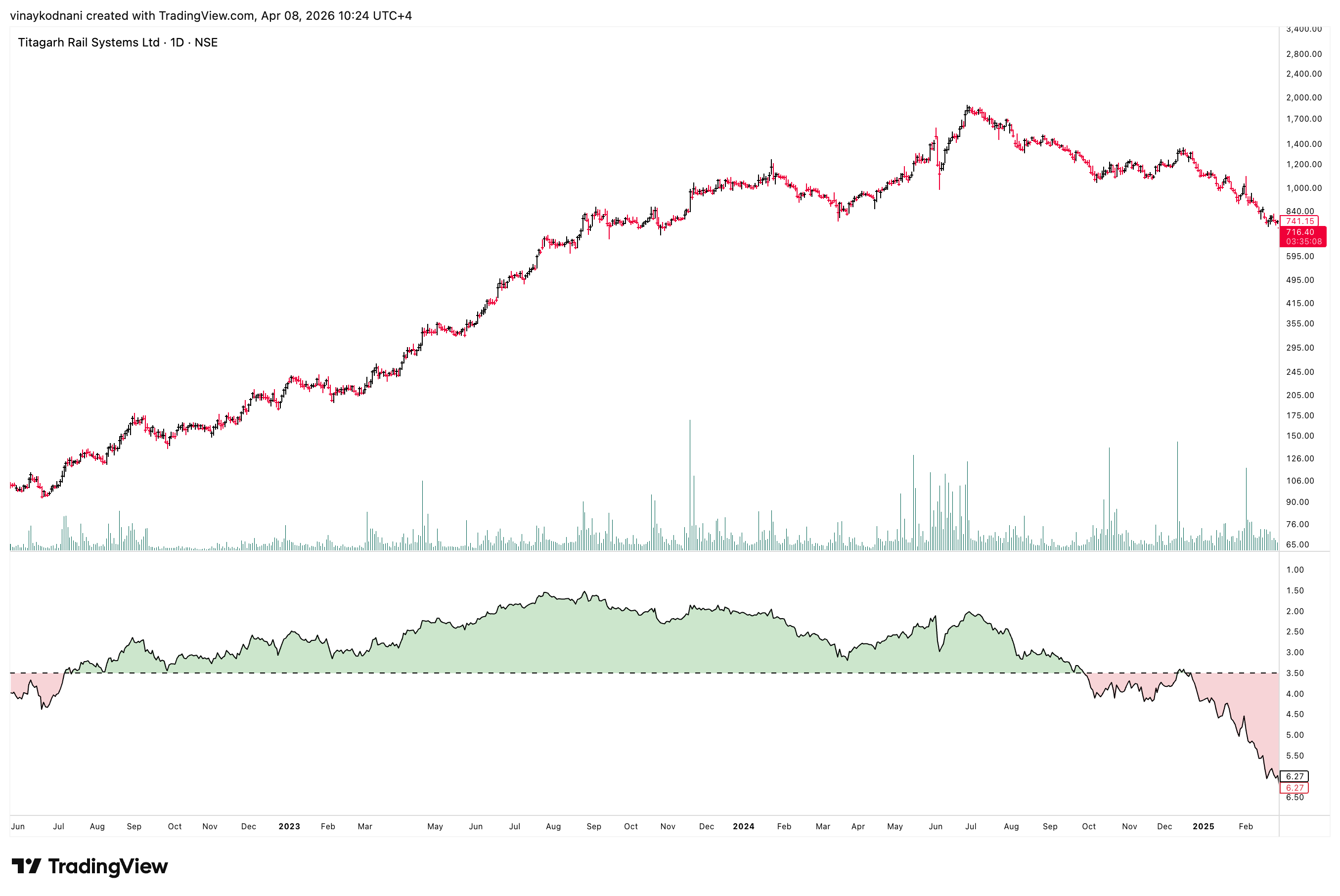
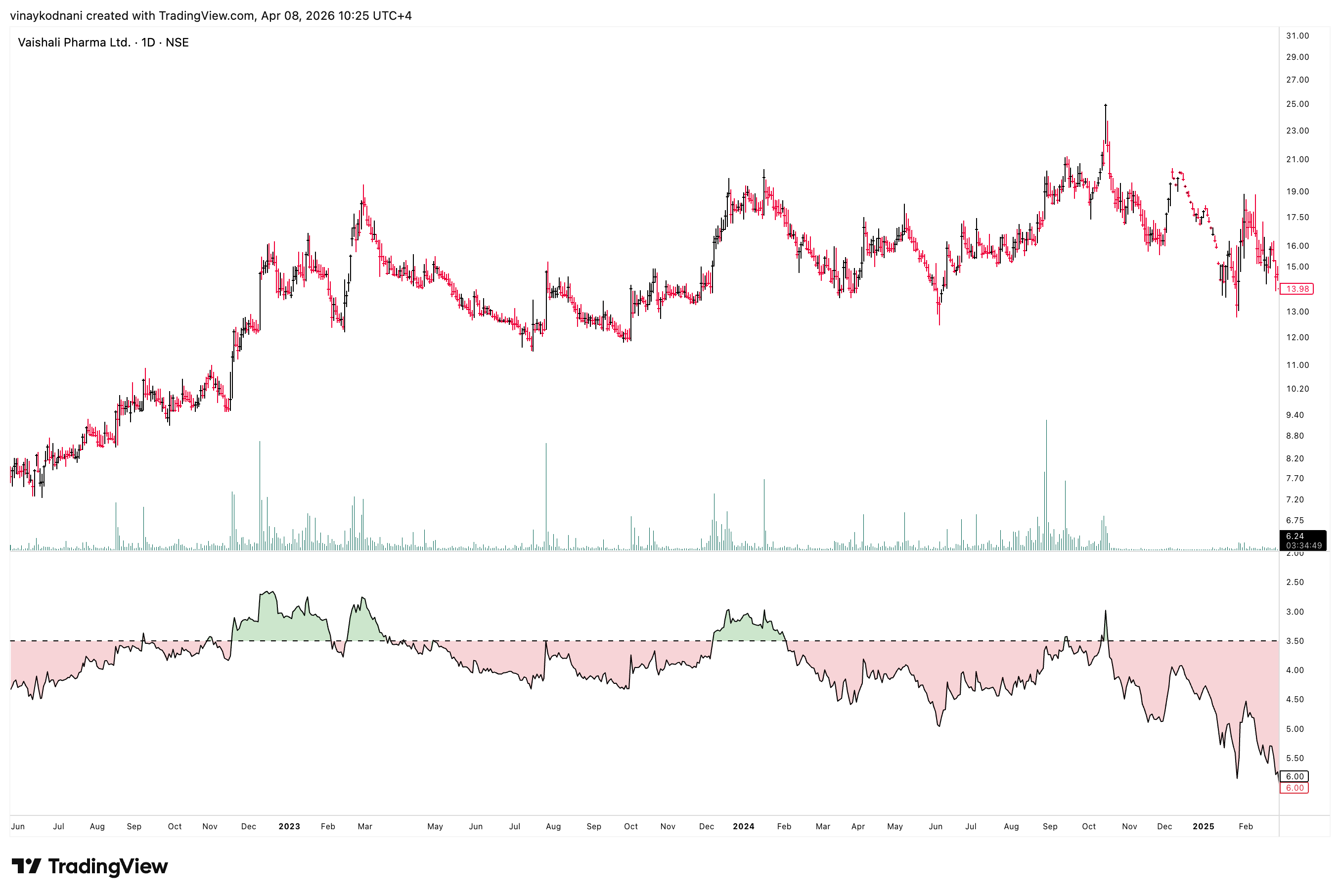
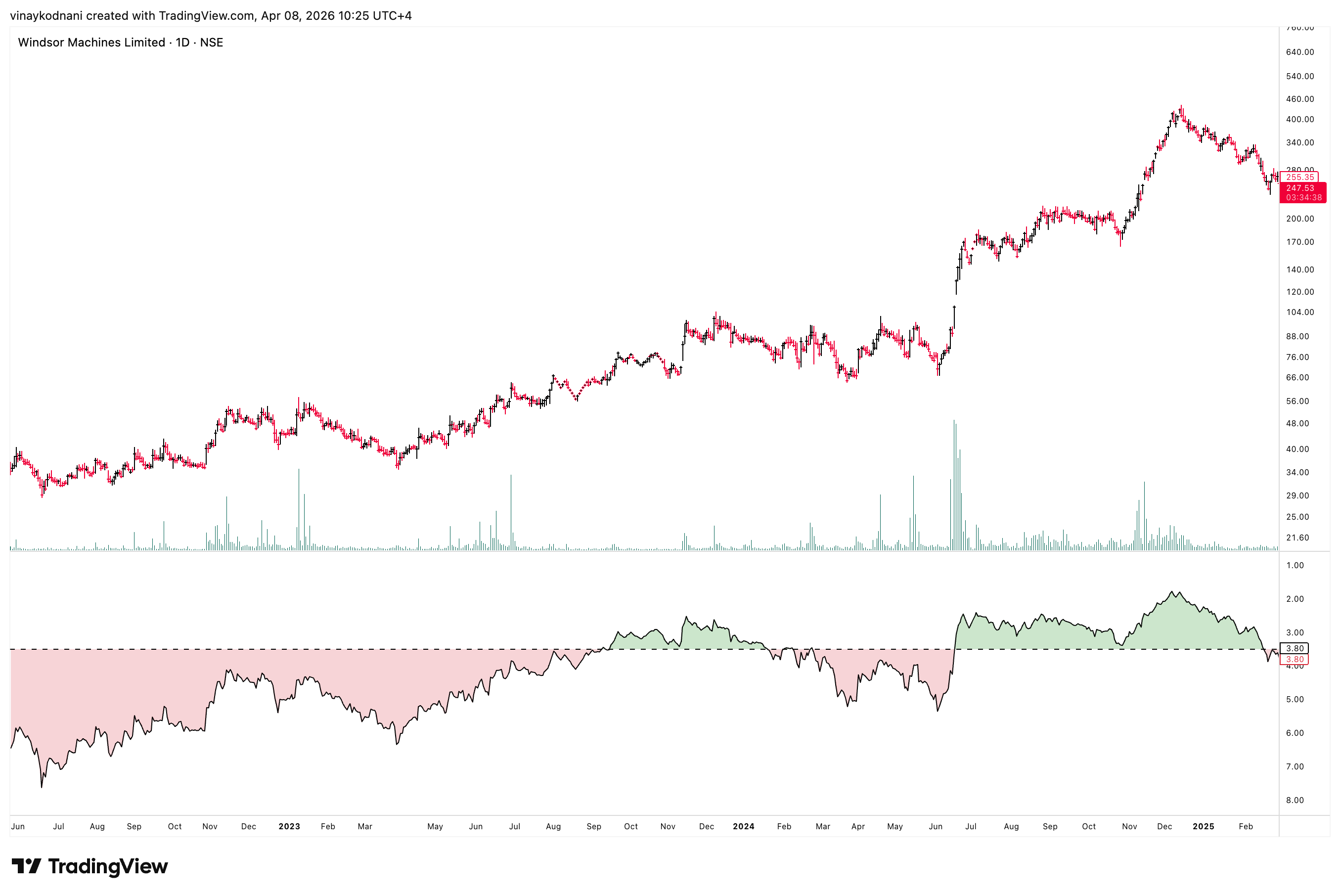
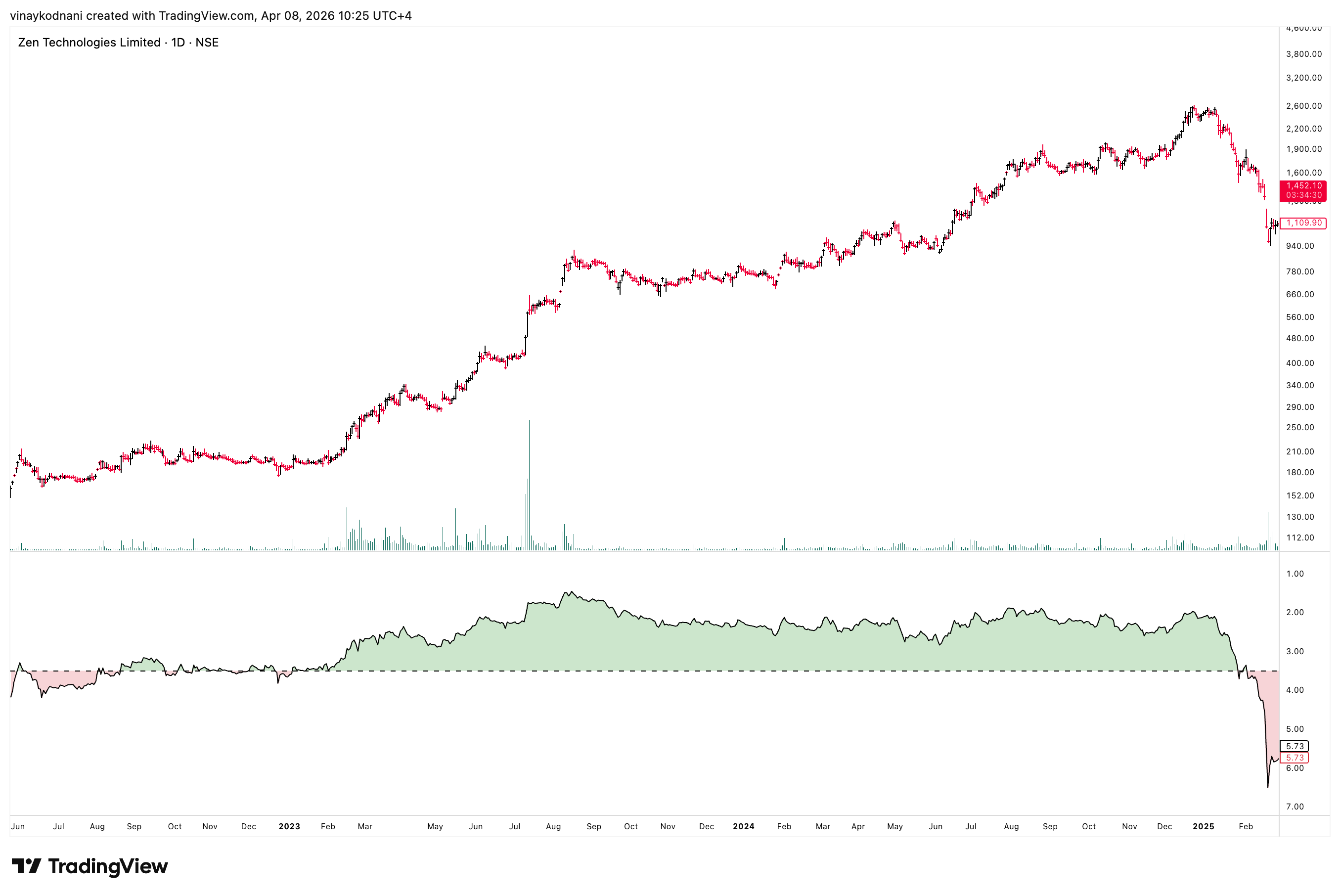
The Golden Zone: 252 Day ATRP 3.5%
After countless hours of research, I have reached a conclusion that most Market Leaders of the last cycle (2022-2024), and even the prior ones, generally have an 252 Day ATRP of less than 3.5%.
This is basically the ATR of the last 252 Days over the Close of Today's Price in percentage terms.
For easy visualization, I then proceeded to add a Horizontal Line at the 3.5% level of the ATRP pane in my charts after which I 'inverted' the indicator.
Why invert the indicator you must be wondering? Well, once you see the charts, it'll make sense why I say it makes visualizing the data way easier.
But once again, do not get confused, the ATRP indicator has been inverted on my charts.
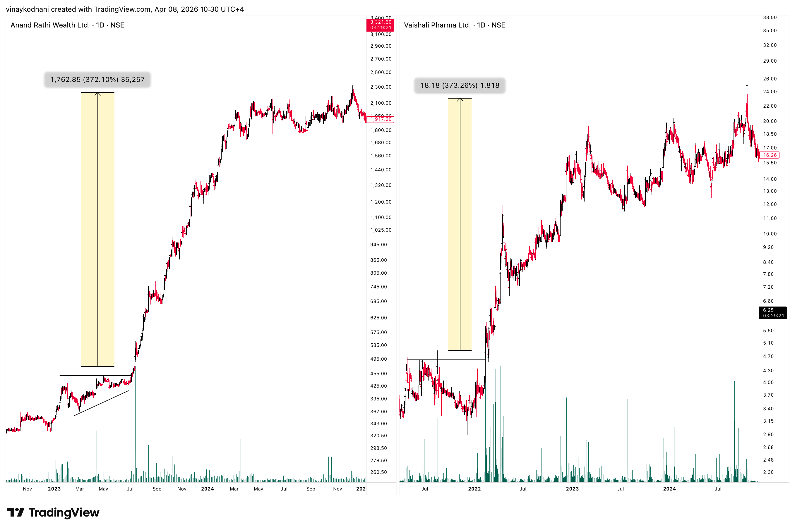
Now let's have a look at the charts I posted at the beginning of this article, but this time, along with their 252 Day ATRP (plotted inverted).
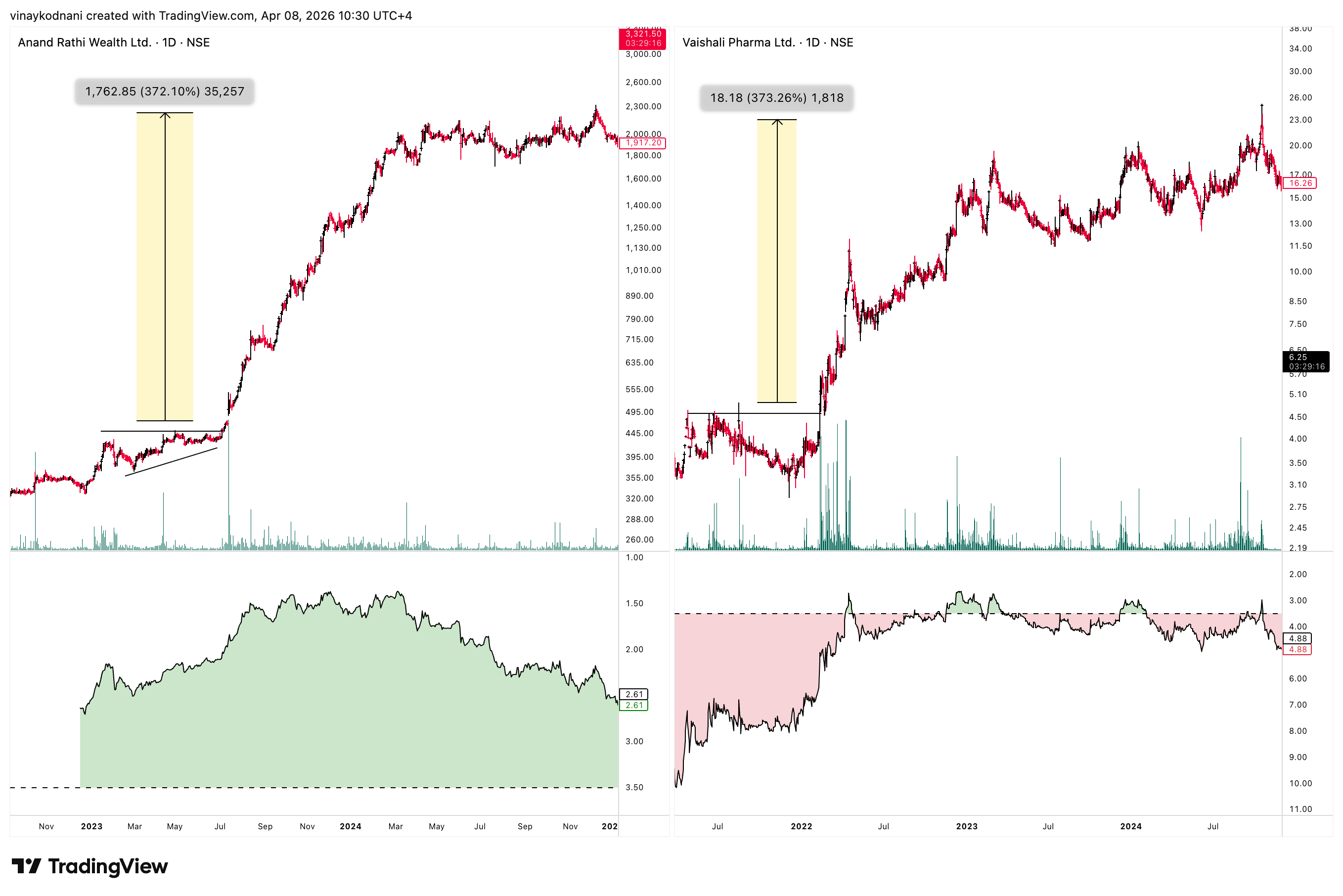
A picture speaks a thousand words. And I hope you see why I inverted the indicator. Visualizing the price trend becomes extremely simple with an inverted ATRP (especially if you even color code above and below the 3.5% level).
Not just that, but note how the indicator also spots divergences and turns down before price itself, as price starts behaving more erratically in the Distributive Phase leading to our inverted indicator trending down (which basically means volatility increasing).
This is an important concept and I hope you get what I'm saying. Re-read this a couple of times till you get the key takeaway, which is, Market Leaders generally trend smoothly when their 252 Day ATRP is less than 3.5%.
Examples of Market Leaders with Inverted ATRP(252)
Here are a few examples of how an inverted ATRP filters out the smooth trending phase of market leaders. Study the inverted ATRP pane along with the price action.
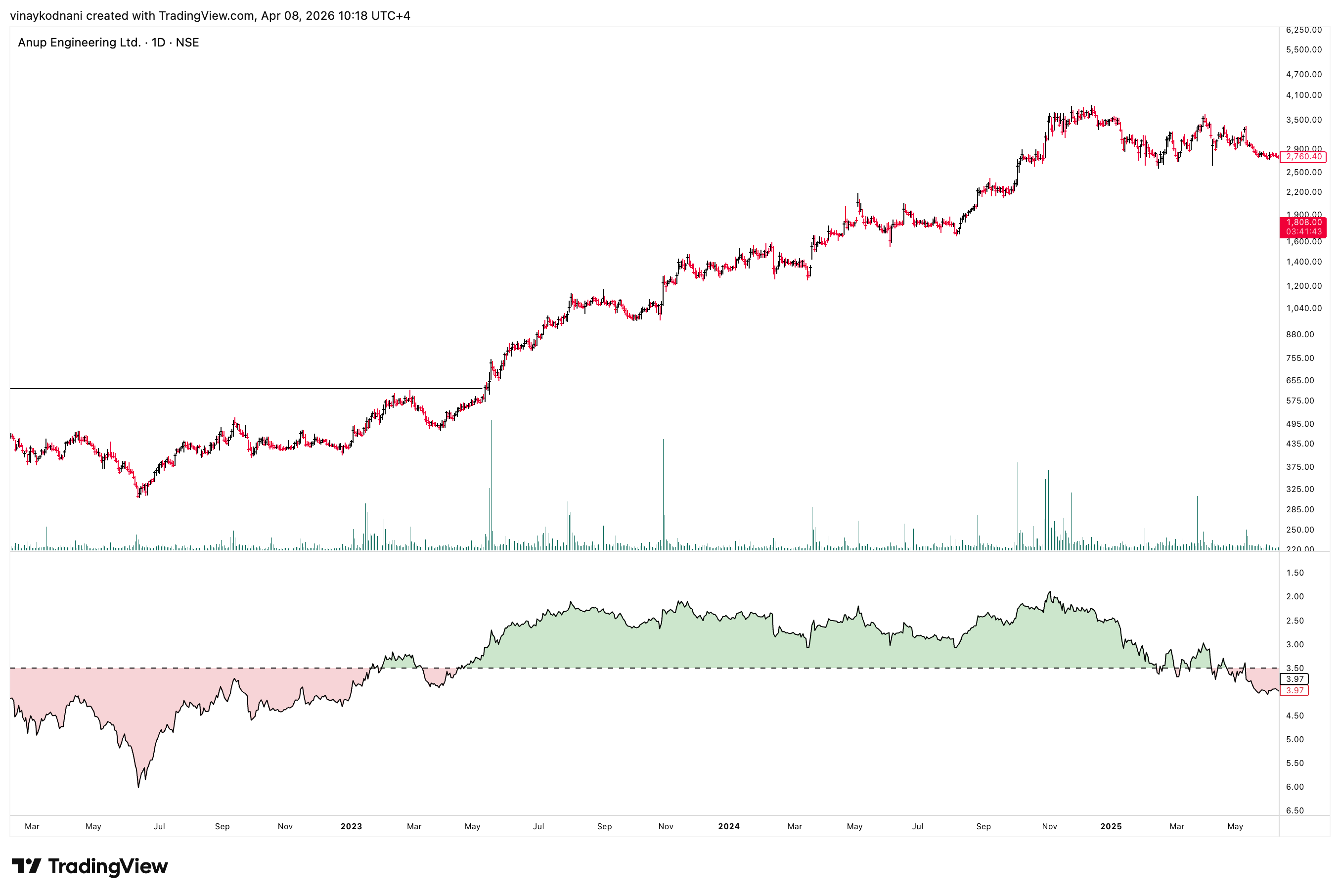
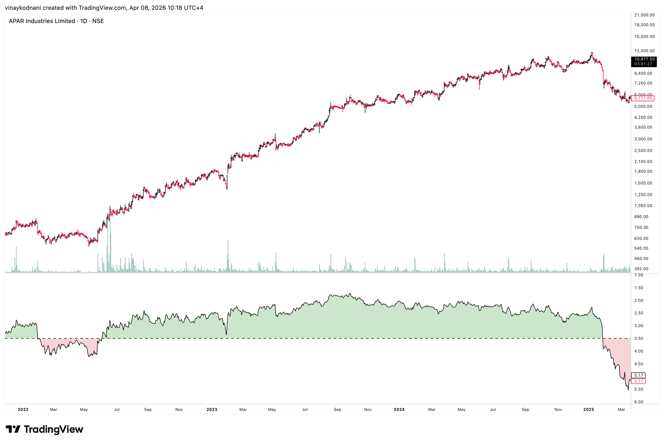
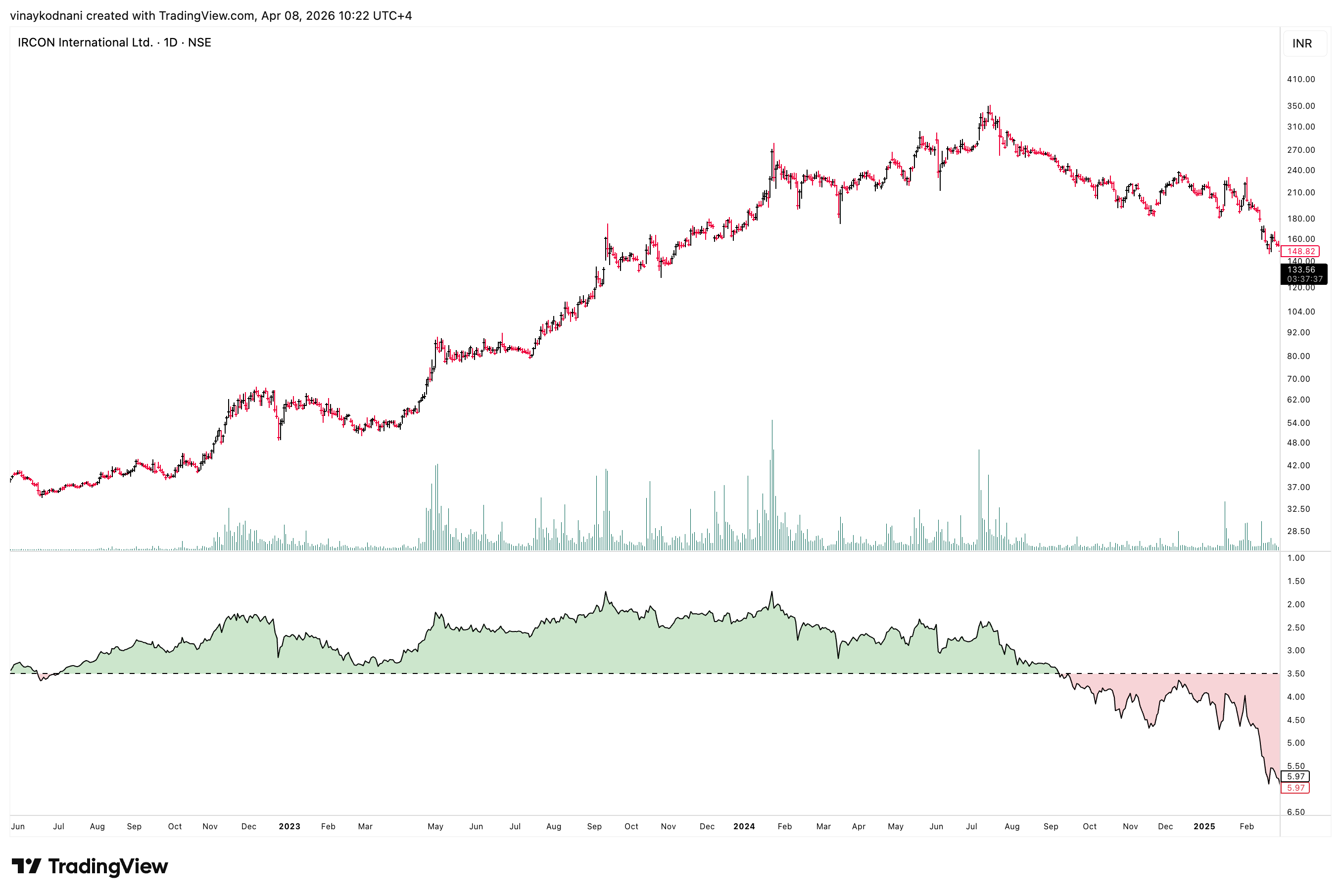
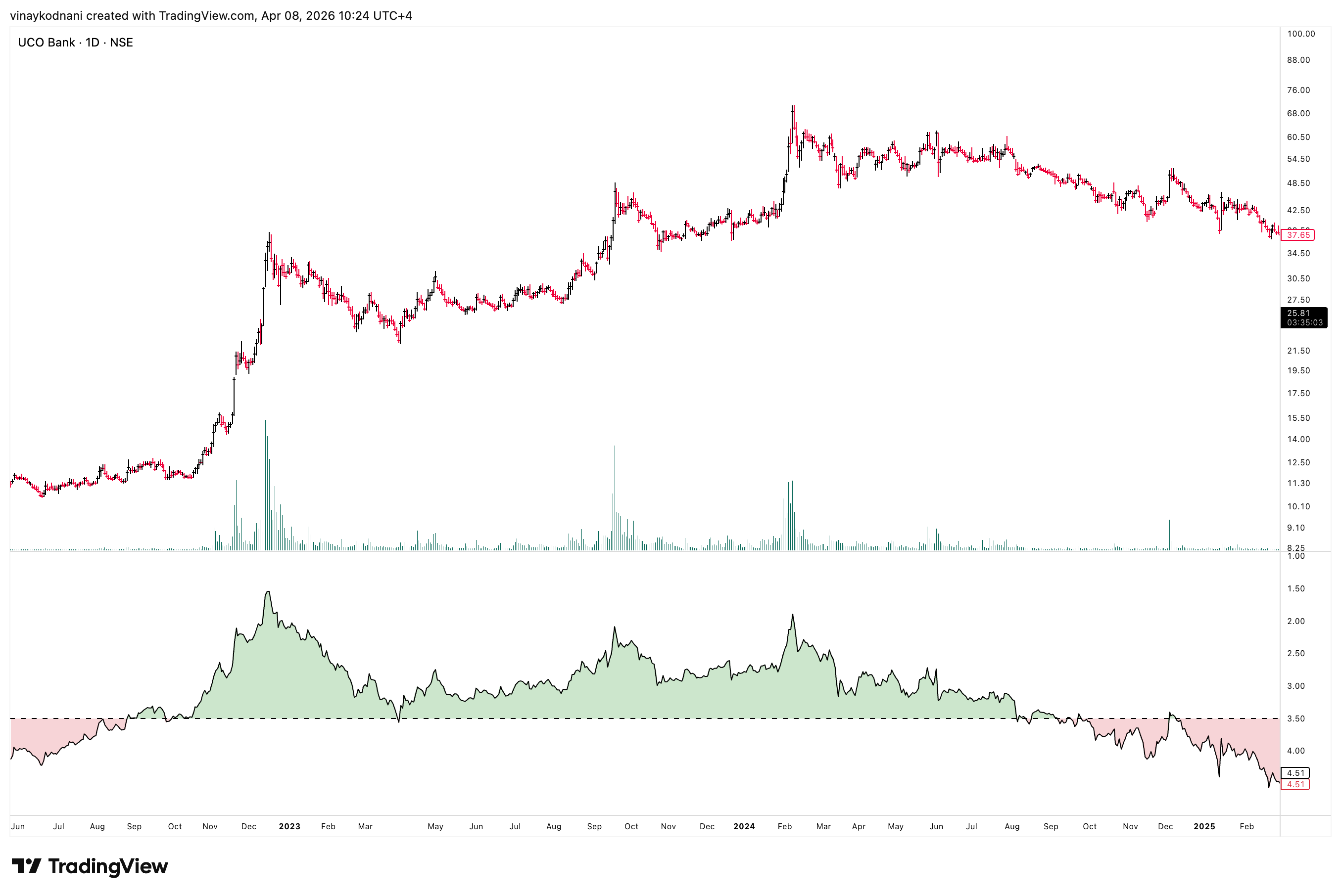
Once you understand these, go through the gallery of charts attached below. Note how stocks where the 3.5% level is not held consistently are a much choppier asset to speculate. The list of stocks is the same as the ones in my post Relative Volume and Market Leaders. This can make it easier for you to compare and study them.
Once you go through these and understand volatility, study my findings on Relative Volume and Market Leaders so that you can train your eyes to put the concepts together and spot leadership at the inception of a new up cycle.
You should also read:
Relative Volume and Market Leaders
In modern times, speculators often say volume is "spoofed" because of high-frequency algorithms that place massive buy or sell orders and then cancel them in milliseconds, creating a fake appearance of demand to manipulate prices without ever intending to trade. Additionally, a huge portion of…